Sparkling Slides
Presentation • Design • Storytelling
May 13
Still working on your slides?
Let’s make your presentation shine.
How are you doing? Still knee-deep in that big presentation?
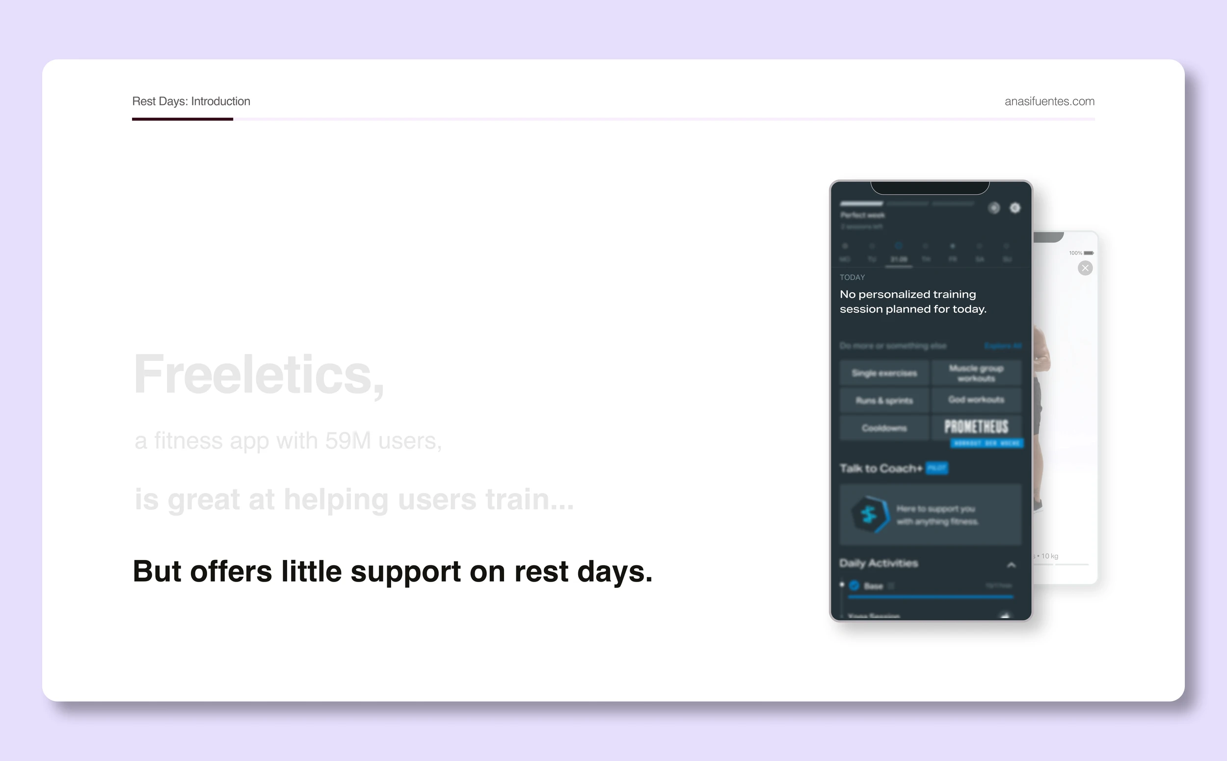
Maybe you’re a bit stuck? Moving one text frame from one side to another for 20 minutes just to pretend you’re working. I get you. It feels like I’ve been working on presentations for weeks — I recently “hired” myself to improve the slides for one of my UX cases and it’s almost done. I had the luxury of time, and even though it has taken quite some work to get the slides to a new level, I’m very happy with the result.
In a previous blog post, I shared the steps I use to make presentation magic. That guide is super useful if you’re short on time and need to be efficient.
Today, I’m assuming you have time to invest, so I’m going to share 3 tricks you can pull out of the bag when you’re really aiming for perfection.
Let me go grab my magic wand again so we can start.

Ready to make some magic happen! (From a coffee shop)
>1. Show > Tell
You know the saying: a picture is worth a thousand words. In this medium, it’s true.
You’re super smart and already know this, here are just some extra sparkles:
New product feature from your app?
Grab a screenshot and place it in a phone frame png.
(There are free ones on Google!)Potential consumer for your product?
Go to this person doesn’t exist and get yourself some photos.Trying to explain a process?
Make a little diagram, even if it’s just shapes and arrows.
What if you can’t find the right visuals or feel your skills won’t help?
My general advice here is to avoid AI. I'm almost 100% sure people prefer to see you collage something together than get a "perfect" example with AI.
Could there be an exception? Can words beat pictures?
I would say yes, maybe if you’re guiding your audience through an imagination exercise and don’t want to influence them. The rule here can be: where human imagination beats pictures, let the mind machine work.
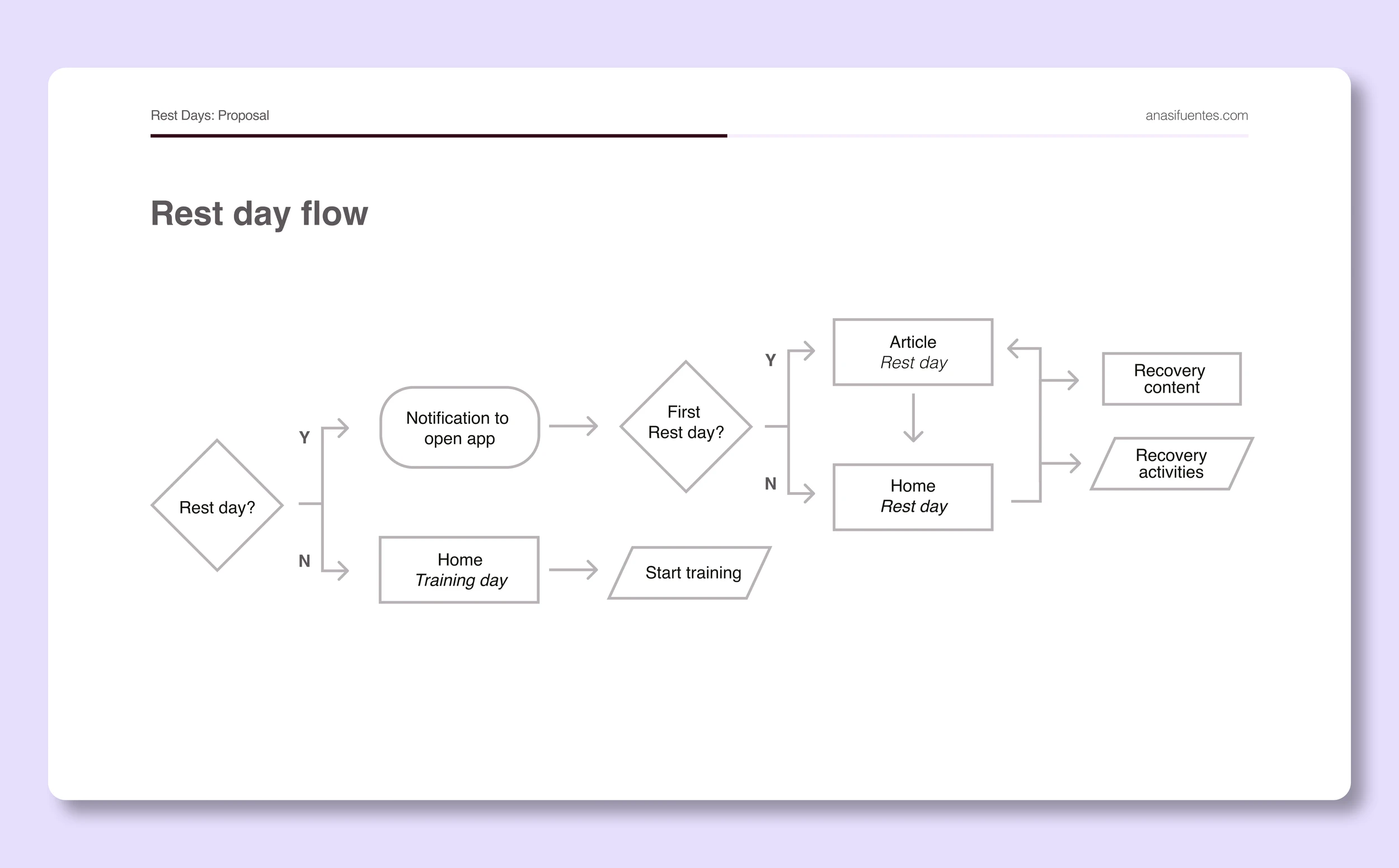
A super simple diagram, just shapes and arrows
2. Less is more
As I said, you’re super smart and already know this.
So, what’s the trick here? How to use this concept in the best way.
Do you already have text on your slides? Is it a lot? It shouldn’t be. Try cutting it down, you don’t want to be seen reading from your slides. Only keep key points. Less than a sentence per bullet point, or even just 1 or 2 key words.
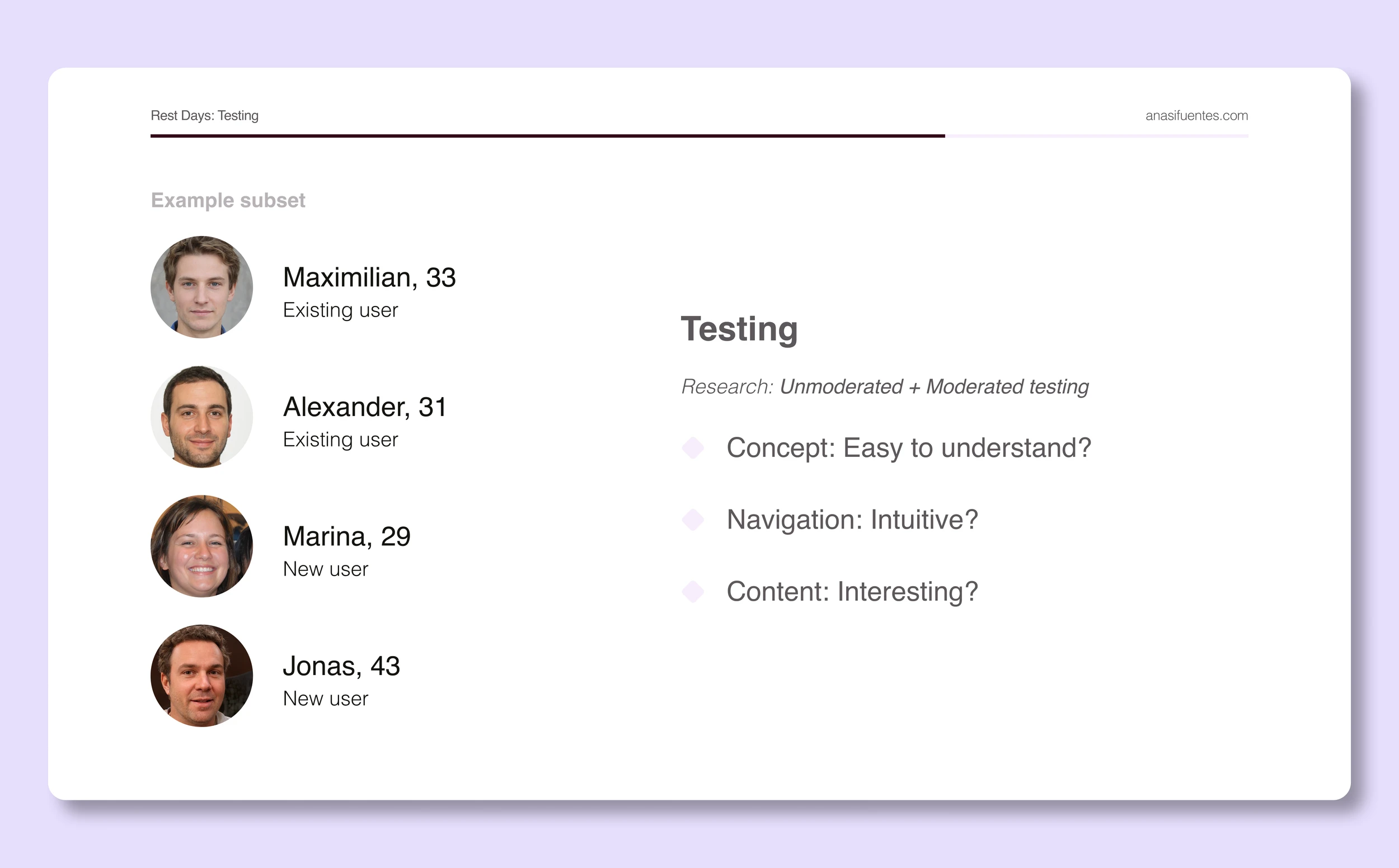
Here’s an example from my very own deck:
I’m trying to explain what we wanted to find out through user research:
We did unmoderated and moderated testing to see if the users found the concept presented interesting and easy to understand, if the prototype didn’t need any explanations or further copy in order for the user to browse through, and finally if the overall content provided any value for them.
What did I write? Just the bare bones:
Unmoderated + Moderated testing:
Concept: Easy to understand?
Navigation: Intuitive?
Content: Interesting?
Now, if you have too many important things to mention in a single slide - break it up.
Split your slides in two or more if needed. Wouldn’t this mean I end up with more and more slides to go through? And shouldn’t you want fewer slides in total?
Nope. Big no. Don’t question me. The end.
Ok, I’m very hard on this point because, at least in my experience, having more slides meant that I had little text in them and had broken them down to only key points. Yes, it’s more slides, but I will go faster through them.
What happens if you can’t get away with having too many concepts in one slide?
Well, we have trick number 3.
Just the main concepts + some “users” from this person doesn’t exist
3. Guide them by the hand
This is a very nice gesture, no? When someone grabs your hand and guides you? Very sweet. You can do the same for your audience.
Let’s set the scene: you have a slide with 3 main ideas, and each one has small annotations below. How can we be nice to your audience?
Use my trick: place the final content on the last slide and then duplicate it and cover all the ideas. Now you can do the in-between slides: in each one, you reveal one by one.
Think about it like very basic frame-by-frame animation.
A trick I’ve learned from the presentation king (my dad) is that you can place an arrow to highlight the main takeaway from your slide. Maybe it was idea 2 that won in the end? Add a little signifier next to it to show it’s the most important thing.
Want another example from my deck?
When I’m presenting the context and the main problem, I’ve split it into 5 slides.
I could do it in 3 or less, but it’s more impactful if I build up the scenario piece by piece:
Slide 1: Client name (introduce the topic)
Slide 2: Good thing they do (adding more context)
Slide 3: Issue they are having (setting up the problem)
Slide 4: Problem (a simple sentence)
Slide 5: Let’s solve (call to action, bring positivity)
Every line here is a simple sentence.
Me and my audience are holding hands through this magical journey - sry, I’m not sry if this sounds cheesy - I’m listening to Broadway songs while I write this.
Reducing opacity is also another way of covering information!
Bibi di babidi boo!
Do you feel the magic now?
I hope so!
I can also recommend some good musical theater songs that will get you adding sparkle to your deck. And if that’s not your vibe, try your favorite playlist as background to put these tricks to good use. I’ve heard K-pop can be very inspiring.
Now, if you need more help creating your best presentation to date — send me a message! I have freelance hours, so we can refine your story together, and I can take care that the slides are pixel perfect.
That’s Enough About Me!
What do you think? What should I focus on next?
Hope your presentation is almost done now! Need any more tips? Maybe a trick or two to find your own voice and presentation style?
Let me know—shoot me an email! 😊
📩
sifuentesanita@gmail.com