System Love
Design • Product • Advice
Jul 17
Or how to stop worrying and love design
systems
Let's start with a brief questionnaire.
Do you
love putting things in their right place?
Is it fun for you to
plan how to use color and fonts?
Is your idea of a great afternoon
adding documentation notes to your designs?
If you answered yes to all, you might have
design system love. I have it too, we are
both sick.
Don't worry, it's not a bad thing to have — you just
might have a bit too much fun
organizing files.
In fact, you might have had this for a while. Even before creating your own variables and styles in Figma — if you’ve ever worked on creating brands or styling something to match a specific look, the first symptoms have already appeared.
What if you want to get it? You want to increase the levels of design system love in your own system? Well, we can go over 3 tips to encourage this.
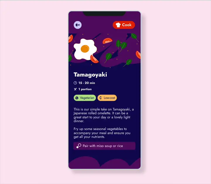
Design system in action: switching between dark and light mode
1) Get comfortable
Let's learn to love the design system. The first step is to get comfortable with what you’re working with and design a few screens. Here there are two scenarios: is there already a set of rules, or do you have to make them?
If there is an existing design system, play with the components — give yourself a simple task. Try a 3-screen flow you can sketch in an afternoon. Ask questions to the other designers and developers. Understand how colors and fonts work in the product you’re working with. Working within a framework may feel limiting, but it is giving you direction. Think of what you create as a piece that should fit in the ecosystem. Make it feel natural and not out of place.
Now if you have to start from scratch, there is infinite room to play — but also a lot more decisions to be made. The recommendation still stands: start by designing a simple flow. By this point, I’m assuming you already have a brand with some basic guidelines (if you need tips on making one, you can check out this blog), so start putting those colors to action.
Want to add another layer of complexity?
Hell yeah, let’s go!
Ok, so the next level is to
turn the screens you designed from light mode
to dark mode
— for those users who prefer darker screens or work
late into the night. Here you will need
color equivalents and start thinking about
hierarchy: What color is your
primary background? What color is the
content on top of it? How does that color
change when we switch to dark mode?
Try some tests and start drafting your rules. Once you are happy with how things look — and double-checked the contrast so your design is accessible — we are ready for the next tip.

Primary background color definitions in dark and light mode
2) Make everyone comfortable
Once we have good rules and tested out colors and fonts, we can start writing about your designs. Get your pens out — it’s time to write! But before you put digital text to digital paper, you have to ask yourself: Who is your design system for?
You might think it’s only for developers using their
developer magic to turn your designs into reality —
but it’s really for everyone. Other designers
will also use your components to create screens,
content writers will work within the space you give,
and the localization team will make sure that text
is ready in other languages.
So, what should we add to the documentation?
Let’s start with the basics: colors for backgrounds, fonts, content, and different statuses (enabled or disabled). Padding and size specs are also essential for the implementation team. If you have all of this — congrats! You have a nicely documented component. Can we add a few cherries on top? Yes.
Think of how your component will be used. When
should we use a primary surface vs a
secondary one? When is the
secondary button a better option than the
primary one?
Giving some rules and examples for your
design team — and honestly for yourself too — will
come in handy to maintain consistency and when
making decisions further down the line.
For example, if you’re giving feedback to your team
to use a different version of the component, you can
reference the design system to make sure
we’re keeping everything in line.
Another cherry? Add details for content.
Yum!
Having worked on the writing side of design (plus
dealing with localization), there are a few extra
notes you can add here. If it’s an element with
text, you can add character limits and
usage suggestions for copy. How do you want
the content designer to fill in the text here? Can
this button handle being more than one line?
Those are extra questions your documentation
can answer. Plus, the localization teams will love you if you
add extra notes and examples for other
languages.

In depth documentation for primary buttons
3) Share the love
My last tip is what helped me
refine my systems the most — it was
talking to developers. I've mentioned before
that they are the ones who
transform pixels into actions, so it might
seem like they're only involved once you finish the
design and hand over the document. But the magic
really happens when we can have
open conversations.
Showing my notes to developers has
taken my components to the next level. We
share ideas on how to handle different scenarios
using the same element and even make adjustments on
the fly, because some aspect of the design might
look different depending on which platform it's on.
Talk to other designers, ask them if there’s anything else that can be added. I like to add a few complete examples to my most versatile components. That way, when someone is creating a screen, they can get some ideas on how to use them outside of the box — without adding another component to the to-do list of our implementation team.
The considerations for character limits wouldn’t have happened if I didn’t work with localization. Looping in everyone who uses the design system is great practice. They don’t need to know the ins and outs of every decision, but a quick intro and a link they can use for reference will go a long way.

Dark mode examples and use cases for a banner
So, how are you feeling?
Ready to design, organize, and document?
If you're like me, you're super pumped to make sure
everything is nice and tidy.
If not, it's okay too — maybe you've come out of
this with some helpful insights for your own
documentation.
If I can leave you with one parting thought, it's
this:
Your design system is about making everyone
else's job easier.
It might not be fun and glamorous spending hours considering uses and edge cases, or putting in extra time to consider character limits — but if you put the love in, you will get it back.
I know it's hard to keep everyone happy, but a good system can contribute to that in a very positive way. It's the pillar of your product — treat it with respect.
Even if your design system is just for yourself as
the sole designer, it's at the very least
good practice. And with some luck, it can be
the foundation for an entire app ecosystem.
Invest the time and make your work count. Do
it for your team — and most importantly,
do it for yourself.
That’s Enough About Me!
What do you think? What should I focus on next?
Do you also love organizing things? Honestly it's my hobby. I actually relax like this. Are you the same or you just like organizing things for design?
Let me know—shoot me an email! 😊
📩
sifuentesanita@gmail.com