Tailor-Made Website
Design • Process • Web
Apr 8
This Doesn’t Fit Anymore
What to do when your website feels "off."
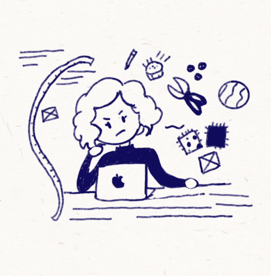
It’s the same feeling as trying on an old dress in front of the mirror. Too loose here, too tight there. A dress I once loved and saw no flaws in now feels… off. There are still parts of it I adore: the color, the pattern, the way it made me feel. But something has changed. That’s how I feel about my website right now.
I’ve put endless hours into curating it, lovingly writing about my projects, but now all I see are its limitations. It’s time to take it to the tailor and give it new life. Luckily, I have the skills to tailor it myself. And since there’s no rush, I can take my time figuring out exactly what I need.
So, let's kickoff this design adventure with one question: What are the current limitations of my website?
Working on the “website dress”
STEP 1: What do i want?
I’ve been thinking about updating my
website for a while. I’ve been with
Squarespace since 2019, after hearing about
it approximately 57 times in various podcasts and
YouTube videos. Before that, I managed to get by
without a portfolio at all. Working at my
first big job for 8 years made it unnecessary until
I wanted to apply for a master’s
program. Then I needed something to
showcase my work. It was promo
code time.
Now, after 6 years with Squarespace, many of their selling points still hold up pretty well:
Easy to use
No coding required
Drag-and-drop interface
Blogging and publishing features
There are also plenty of analytics and
commercialization features I’m only
now discovering as I revisit their info website.
Ok, these all seems pretty good what are
the downsides then?
The biggest problem is
customization. I can’t structure my website
exactly the way I want to. The dress currently can’t
be adjusted to my needs. What are those exactly?
Glad you asked!
-
Simpler navigation – I hate having all my project titles cluttered at the top of my page.
-
More visual creativity – I’d love to include some fancy transitions and animations.
-
Better layouts – I want to structure my site so that form follows function.
-
Stronger information hierarchy – My content needs to be easier to browse.
-
More languages - I want to have my content in Spanish and Portuguese.
At the same time, I still want to:
-
Highlight my best professional work.
-
Continue publishing my blog.
-
Leave room for potential new sections ( new media, topics, or projects)
Ok, so now we have the list of what I want. Let’s move on to step 2: what types of pages do I need to redesign?
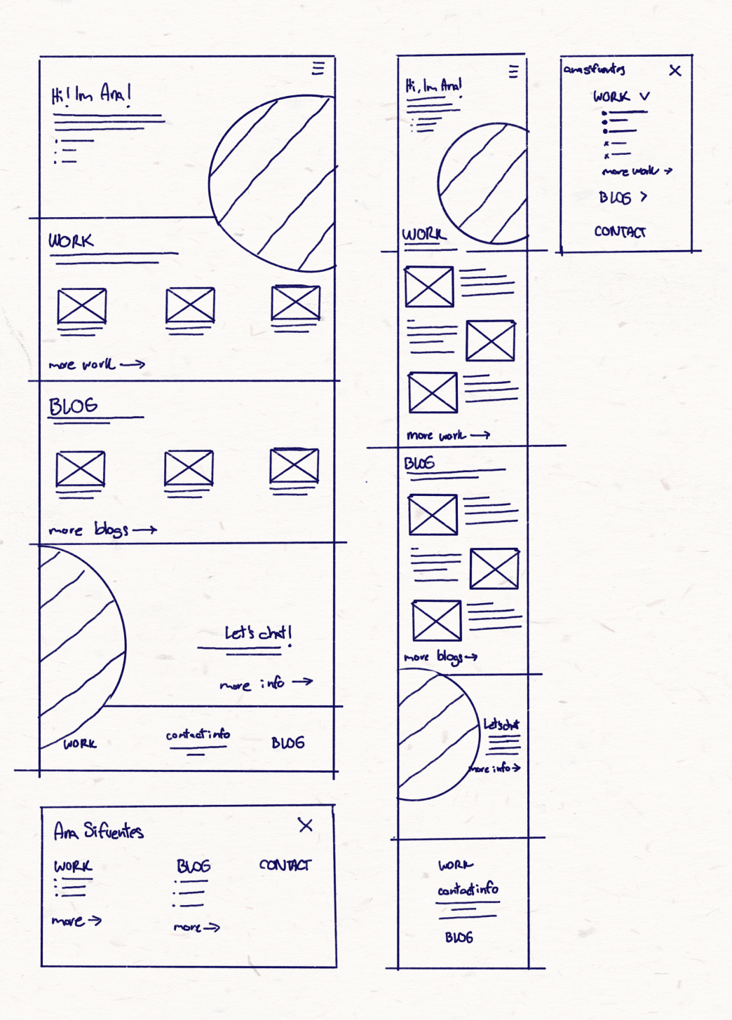
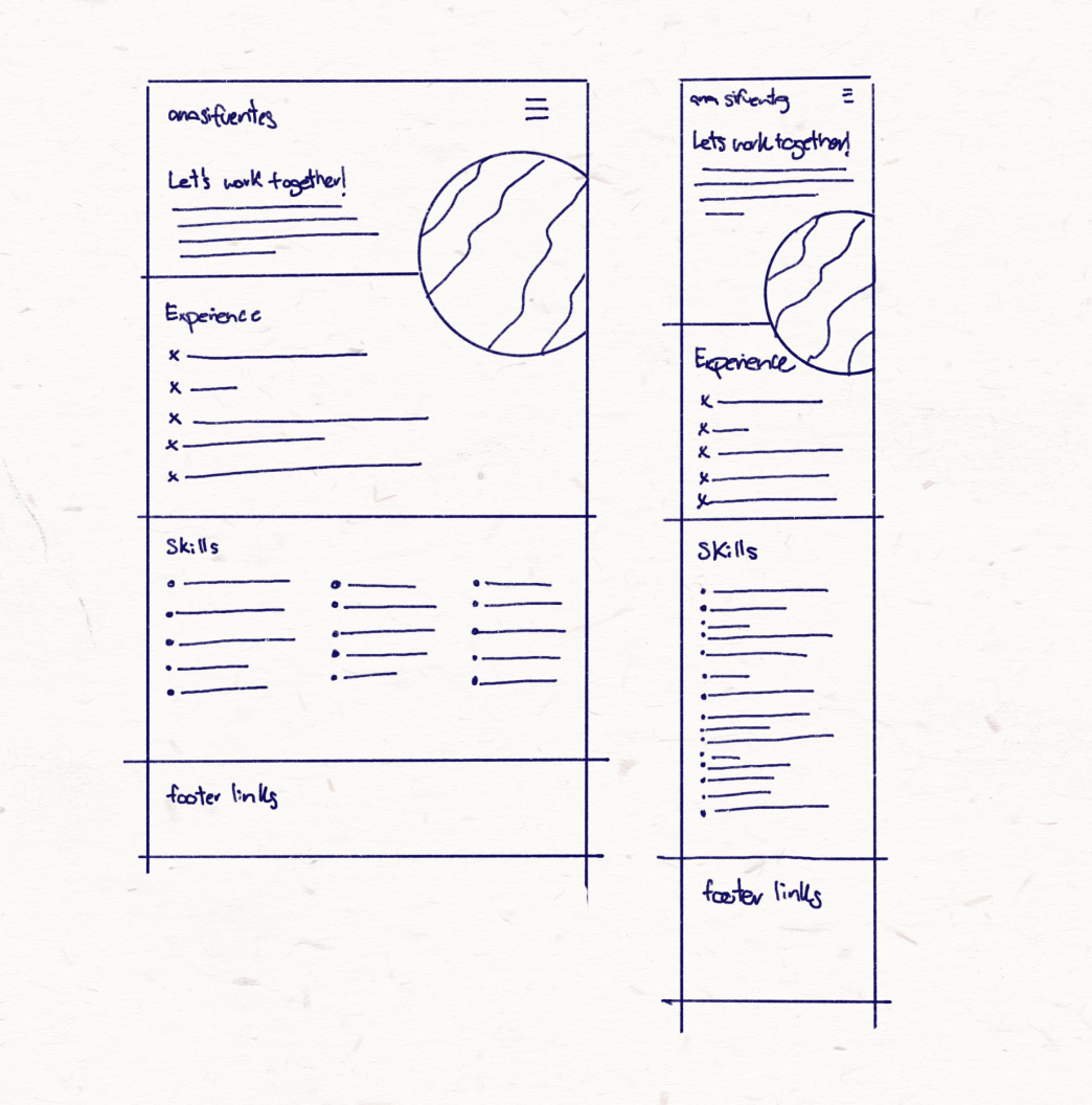
Website sketches: A) Main landing page
STEP 2: what do i need?
These are the different types of pages I want to have in my website:
Main landing page
-
Work overview page
Main project article
Secondary project article
-
Blog overview page
Individual blog article
About/contact section
Website sketches: B) Blog landing page + Project landing page
Most of these already exist, except for the secondary project article. What I want to do is make a distinction between in-depth UX/design projects where I was involved in the end-to-end process versus smaller projects. The main difference between these pages will be the level of detail. Bigger projects will have a design that best suits the content while smaller ones can do with an “article” layout similar to a blog post.
How would all these pages look hierarchy-wise?
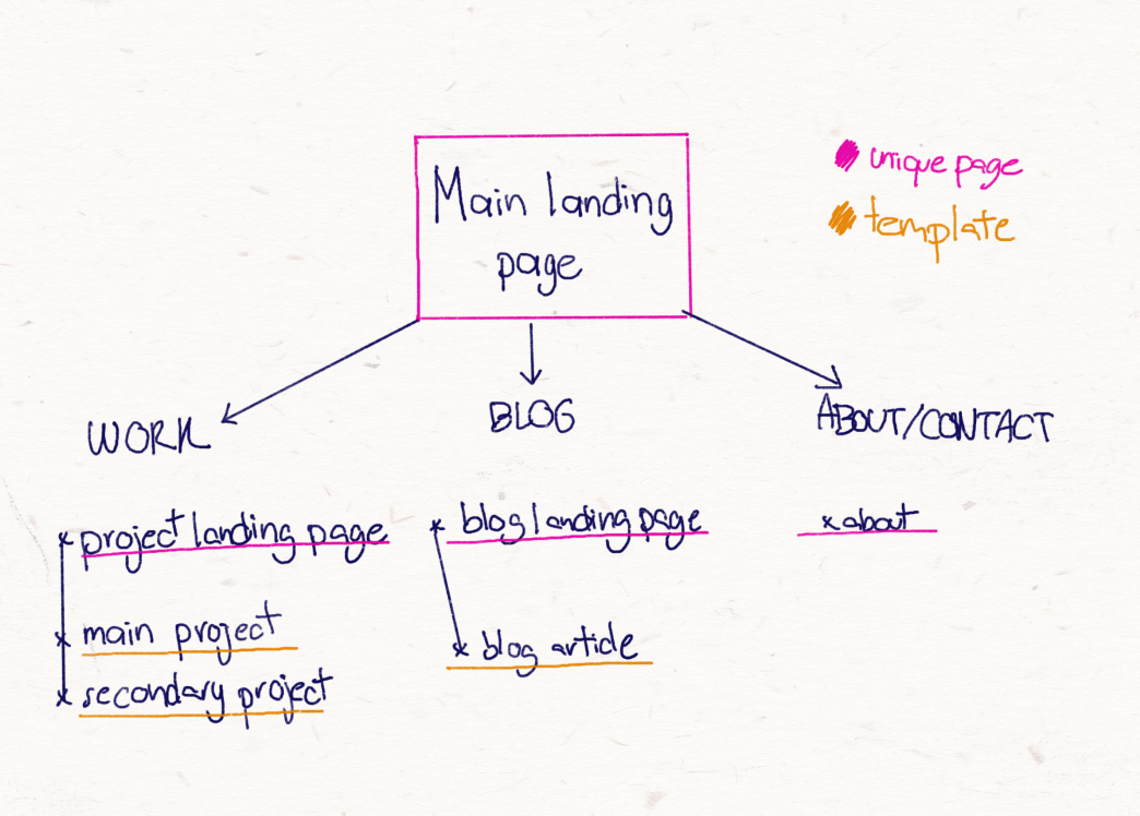
Website hierarchy
So according to this, there should be 7 different page types: 4 unique pages and 3 types of templates. I don’t need to reinvent the wheel though, there are some design and layout elements I like already from my website. I can keep what I want. We are not making the dress from scratch.
Also, I already know what my goals are for the site, so let’s define some user experience ones. My new website should be easy to navigate. I want visitors to always know where they are, and they should also intuitively know there’s more content to explore.
I write these blogs for myself, but hopefully
someone else might find them useful. Key
pages should be easy to find and they should
be highlighted. If I spent months working on
an end-to-end design project, we’re all going
to read it.
Right? Right.
So now I know what I want and what I need to do. Now I need to merge these two into some initial layouts. Let’s put some digital pen to digital paper and start sketching in step 3.
Website sketches: E) Contact page
STEP 3: how DO I organize my website?
I’m bad at keeping surprises, you already saw
some of my sketches…
I always try
to sketch for both mobile and
desktop since I'm expecting people to look at
my website on both devices. People who are
reviewing my portfolio might be more
likely to do so from their laptop, while
blog readers might do so on the go
from their phone.
As I said before, I don’t need to reinvent the wheel when making this website. Even in my redesigns, I can reuse elements. These will also help users navigate the whole site, as they’ll know what patterns to expect. With this in mind, I sketched out how I want the menu to look like on both devices. The top bar with my name and the hamburger menu can remain sticky at the top of the screen so it's easy to access all of my content.
I also subgrouped the pages again
by types of layout:
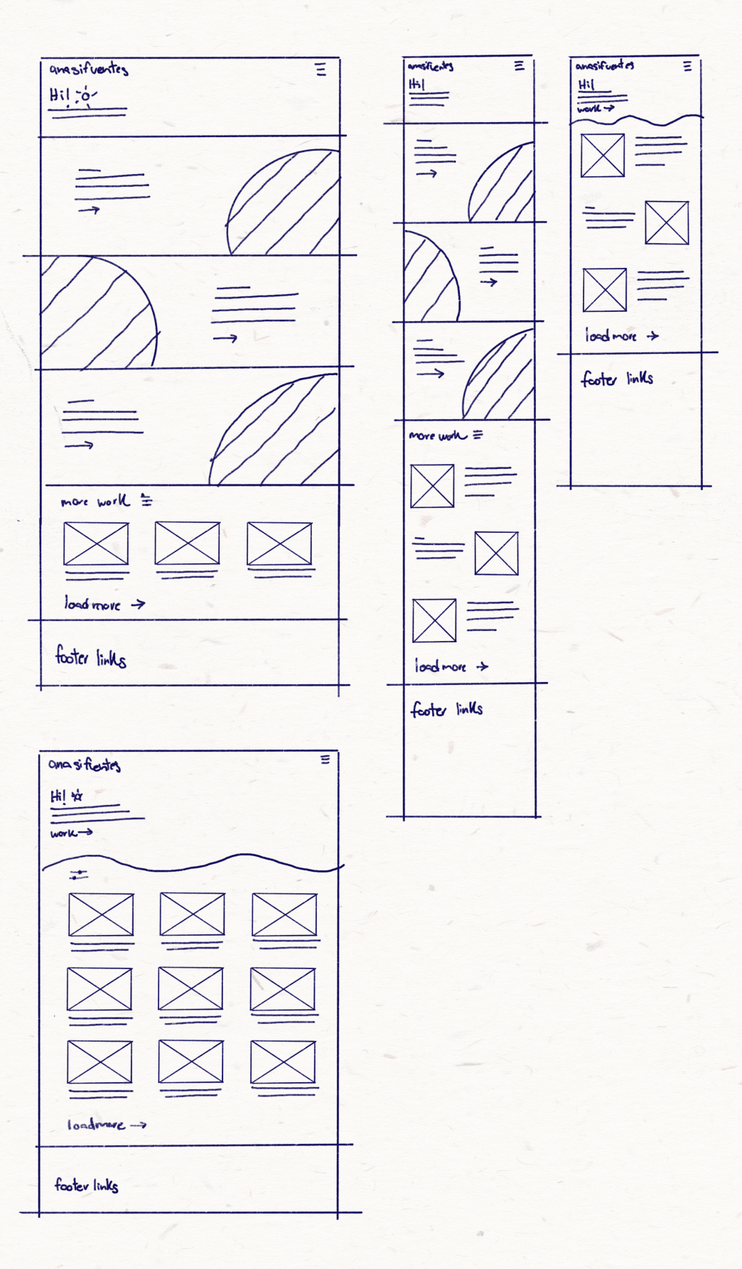
A) Main landing page
B) Blog landing page + Project landing page
C) Main project pages
D) Secondary project pages + Blog articles
E) Contact page
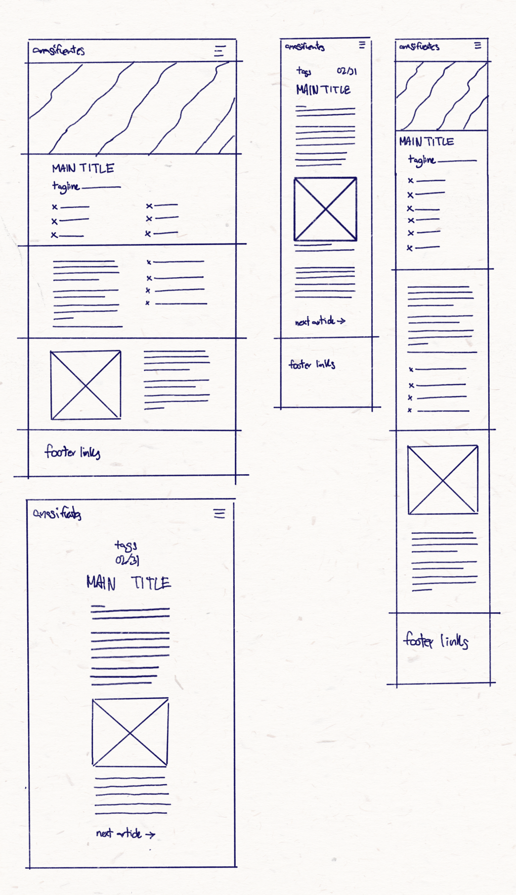
Website sketches: D) Secondary project pages + Blog articles
My plan to reuse layouts within these subgroups will work very well. For example, when I have several articles or projects, I want users to intuitively know there are more to browse if they scroll down.
There are pages that by their nature need to be unique. Particularly the main landing page, it will do a lot of heavy lifting to keep users on my site. That page has the responsibility to set the tone for everything that follows, introduce me, and set some navigation expectations. It has to be both simple and engaging. That’s why I chose to have a quick and fun executive summary of me and my work, plus a nice photograph that says, “I am very obviously a designer.”
We have some initial layouts!
Hurray!
What’s next?
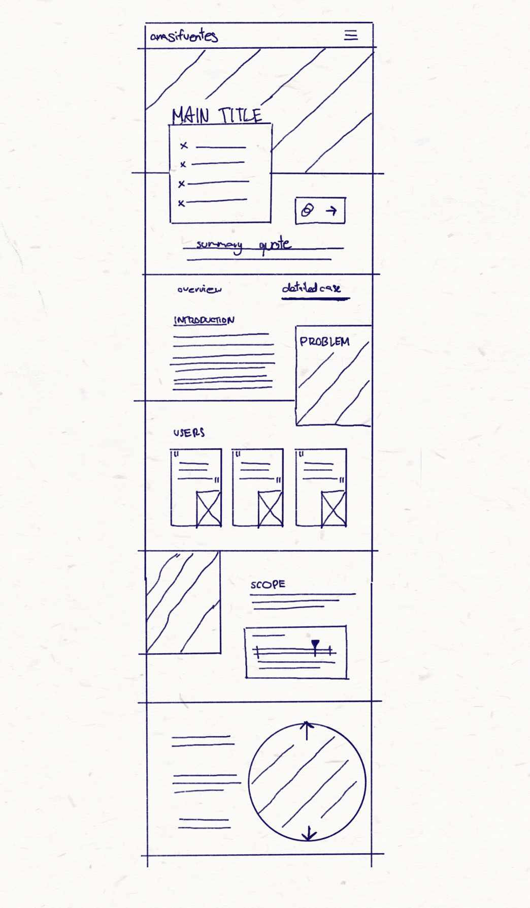
C) Main project pages
Next steps
I will let these layouts sit for a bit. Like bread, they need some time to prove. I want the ideas to linger in the back of my head for a bit and see if anything changes. Particularly for the main project pages, these ones need to be able to best the serve the contet so I simply made some potential layouts I can use to organize the very thorough documentation I will write.
I still need to refine and clean up my
sketches into actual clean
wireframes and then apply some styling. We
can say that we’ve disassembled the
dress, and that the new
fashion sketches are done. Next, I’ll
clean up my lines and look at fashion
magazines for inspiration. Then I need to
make the pattern before cutting the material
again.
That analogy kinda makes
sense, right?
Let’s say yes for
now.
That’s Enough About Me!
What do you think? What should I focus on next?
Should I just go ahead and learn Typescript and code all of this myself? Maybe I can go back to wikimedia days and just use a combination of CSS + Javascript + tape?
Let me know—shoot me an email! 😊
📩
sifuentesanita@gmail.com