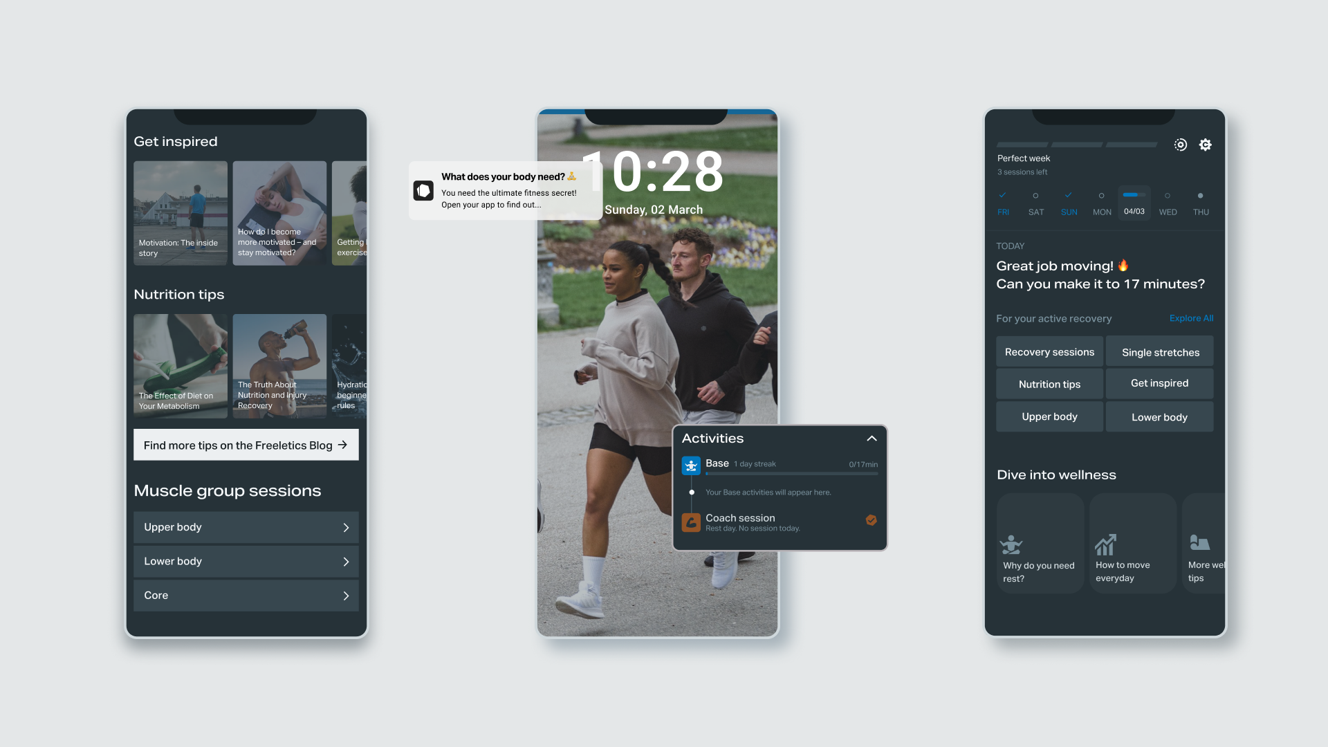

🏆 Outcome: Proof of concept
My team and I explored how to keep users engaged on their rest days by creating a new content experience for the Freeletics app. I worked on the concept, copy, strategy, and UX/UI design to make off-days feel valuable. The goal was to keep users engaged and motivated even when not working out. Through some small redesign changes and precise copy edits we gave users helpful tips to fuel their recovery and increase app opens.
Continue reading for the detailed case study.
Freeletics, a fitness app with 59 million users, is great at helping people reach their fitness goals. Through personalized workouts, tailored to your schedule and available equipment, the app is there to make you the best version of yourself.
But what happens on your days off? If you’ve scheduled three morning workouts a week, what keeps you coming back on the other four days?
This was long-standing gap in the app: how might we bring users back during their rest days? This was a tricky challenge as it needed to account for multiple stakeholders, technical constraints, and tight deadlines.
We noticed that features available during rest days were underperforming. To understand why, I conducted an initial round of research using Amplitude, surveys, and customer support feedback.
It quickly became clear: users didn’t understand the value of recovery or how to use the app on days off. Many believed their scheduled workouts were enough—and without clear prompts or encouragement, they simply didn’t open the app.
We found patterns in the feedback:
“I just follow the training plan. On rest days, there’s nothing to do.”
“My schedule is already full. If I’m not training, I’m not opening the app.”
“I’d love to do some recovery, but I don’t know what’s helpful.”
🔎 Research sources: Amplitude, user surveys, customer support tickets
We landed on 3 key insights:
As a Freeletics user myself, I felt it too—on rest days, the app felt quiet and disconnected. There was an opportunity to offer support, motivation, and gentle guidance even when users weren’t training.
🔑 Key Learning:
Users need support during rest days
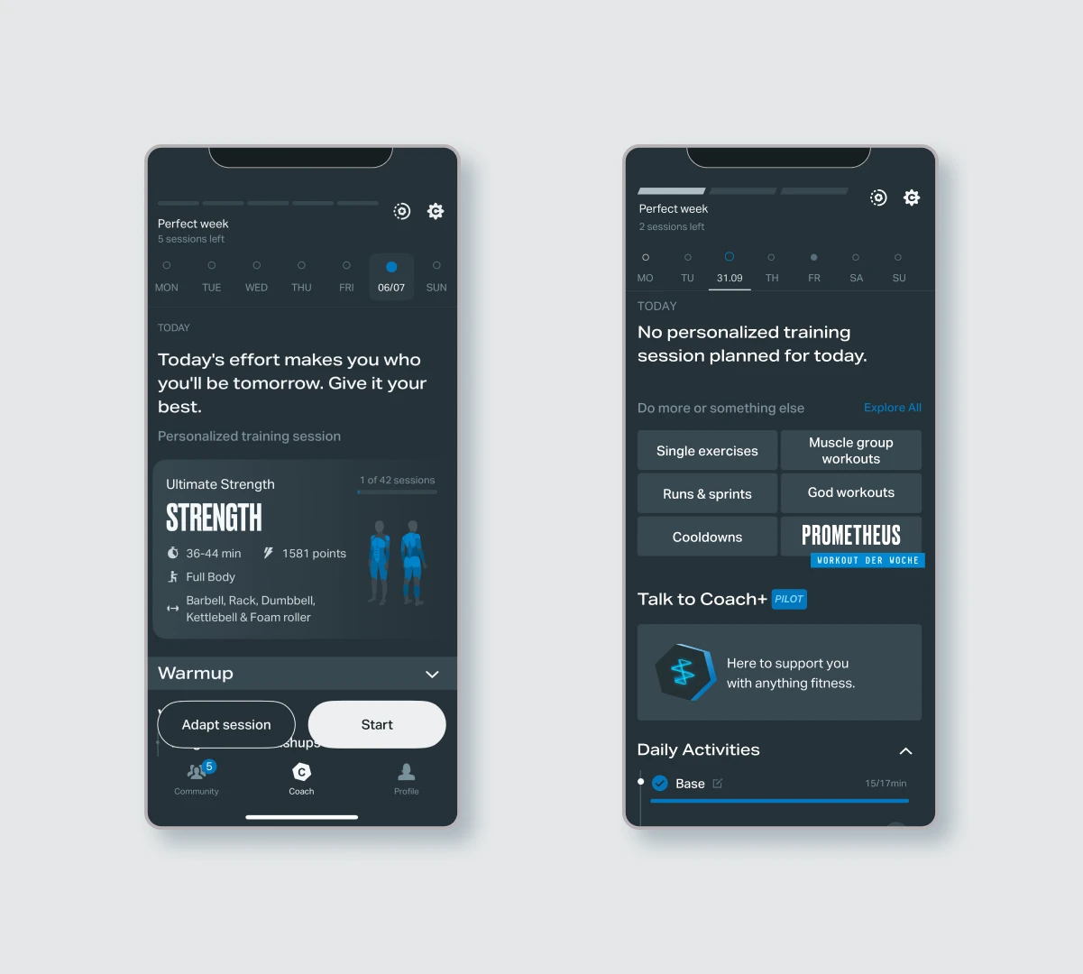
Training day vs non-training day
At the start, the problem was broad: why were users not engaging on rest days? There were several directions we could take—from improving underperforming features to exploring new engagement strategies. But with limited implementation time, we needed to define a clear goal.
After conversations with the PM, my direct manager, and other stakeholders, we aligned on a business priority: increase app opens on rest days.
This focus was especially important because our user segmentation showed that 73% of users rely on external motivation. Without regular touchpoints, they were more likely to disengage completely.

Source: User segmentation survey
With the goal aligned, I could narrow the scope and make informed decisions. I studied the app and asked: where could small, targeted changes have the biggest impact?
The home screen emerged as a key opportunity. It's where users track their workouts, preview the week, and decide what to do next. Since we couldn’t redesign entire screens, I focused on small interventions that reused existing components and respected our tech constraints.
I clearly defined my focus—and what I would deliberately avoid:
👩🏽🎨 Design decision:
Focus on minimal edits on the home screen for the
highest potential impact
To explore how we might better support users on their days off—without adding pressure or creating burnout— I ran a quick competitive scan. I wanted to understand how other platforms approach recovery and rest.
What are similar apps doing?
🔎 Research: Competitive analysis
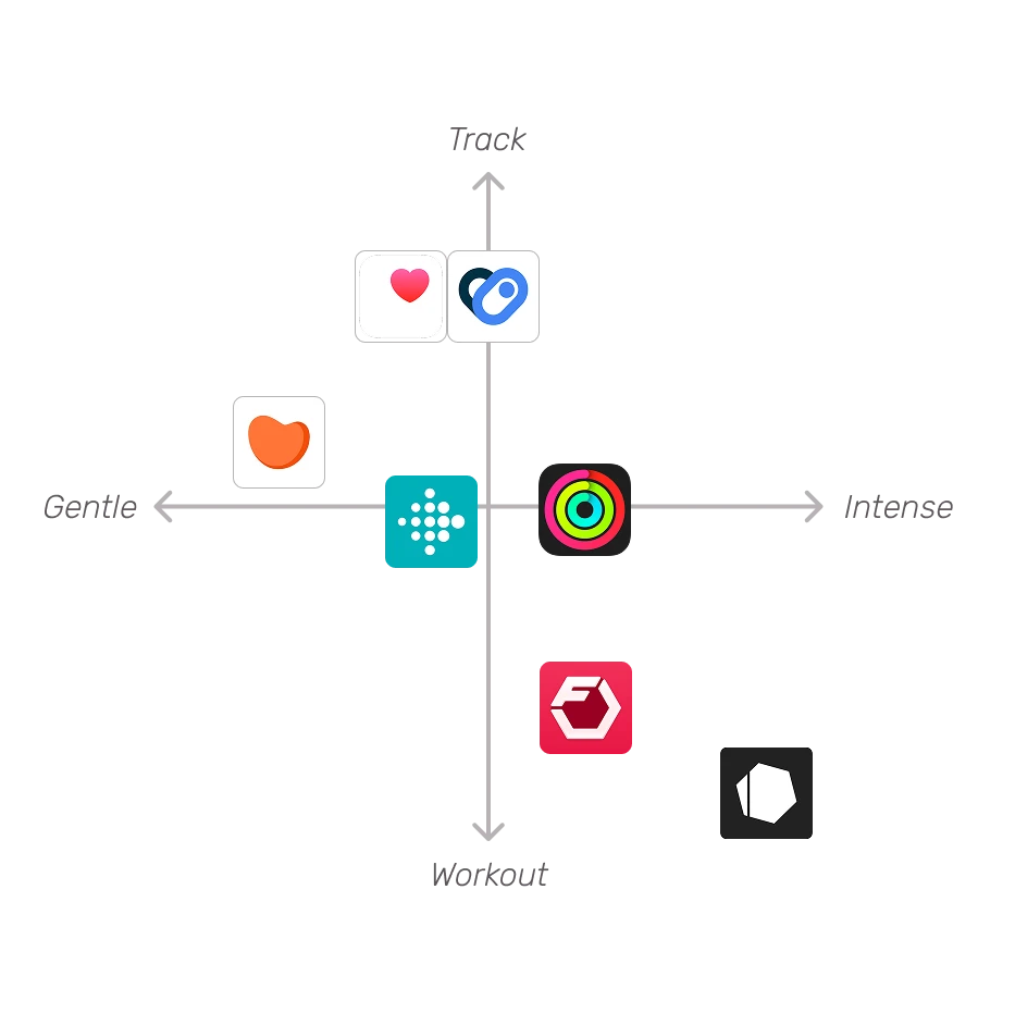
I also looked beyond workout-specific apps. Platforms like Google Fit and Apple Health stood out for tracking activity continuously, not just workouts. That allows users to feel like “something counts,” even if it’s just walking the dog.
To complement this, I browsed forums to hear how real users talk about recovery and motivation:
“I went 4 months without a rest day. May came and I said screw it. I can’t keep it up for a year. Kind of deflated but whatever. I’m not a bot.”
“... I never try to close all my rings on Sunday. That’s my rest day. I don’t really care about maintaining my streak but a lot of people do.”
🔎 Research: App reviews, Community forums
Some apps are already supporting this mindset. Gentler Streak and Fitbit offer a more holistic approach— surfacing lighter recovery options when needed, and framing recovery as part of the journey, not a pause from it.
I distilled these takeaways into a few key insights:
With scope limitations in mind, I aimed to reuse content we already had as much as possible. I approached our internal content review with 3 guiding principles: Reuse, Repurpose, and Rewrite.
Freeletics already offers cooldowns and mobility routines —perfect low-effort content for rest days. I also identified several warm-ups that could double as light recovery.
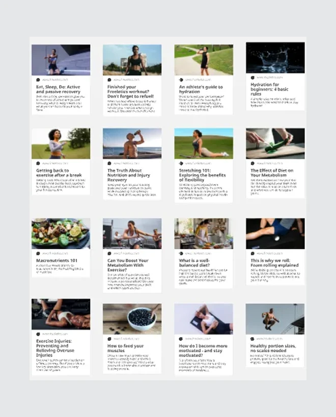
The Freeletics blog is another underused resource, with over 1,000 articles covering training tips, nutrition, sleep, and motivation. I had previously worked on tagging and categorizing this library, which allowed me to curate relevant articles to surface during rest days.
To understand where and how to integrate recovery content, I broke down the structure of the home screen. At the top, users see the Perfect Week tracker, calendar navigation, and settings. Below that is the daily message, then the personalized session module: warm-up, workout, and cooldown. At the bottom are quick links to explore other features like single exercises, signature workouts, and the “Create Your Own” tool.
🔎 Research: Home screen audit, Input from PM
👩🏽🎨 Design decision:
Audit home screen to understand where we could have
the biggest impact
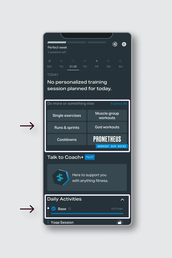
Two areas stood out as high-impact opportunities: Quick Links and Daily Activities. The first could highlight hand-picked recovery articles or sessions. The second could surface a gentle movement summary, like steps or walks tracked from outside the app—helping users feel like “something counts,” even on rest days.
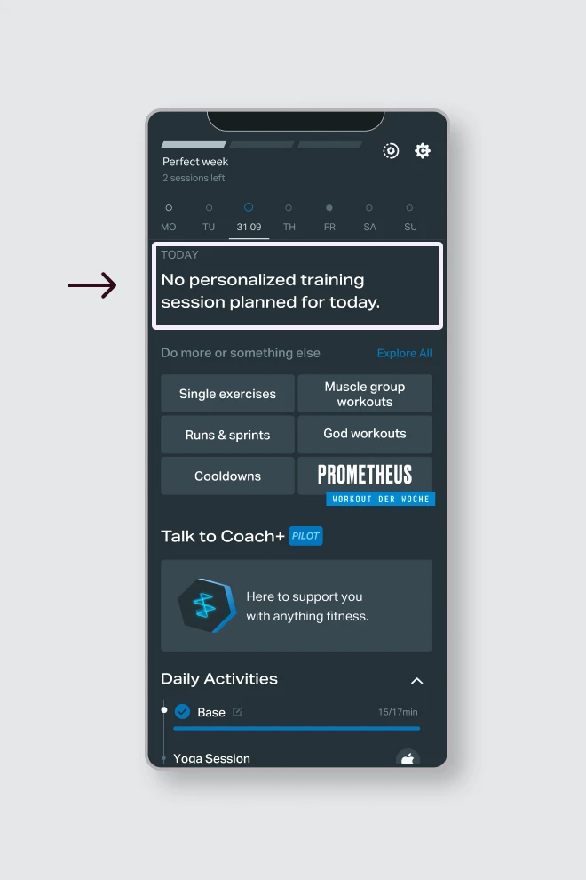
Small copy changes can drive behavior. I focused on the daily message—the first thing users see when opening the app. This copy could reference recent activity and offer motivational tips or reminders. Here we could nudge users to move, reflect, or recover—without adding pressure.
I turned my research findings into a set of proposals to review with the technical team. Together, we explored what could be implemented quickly while still creating a meaningful experience for rest days.
We discussed building a dedicated recovery hub within the app—one central place to host links to recovery routines and curated blog articles. I also outlined a content strategy that would bring users back with push notifications, introduce the concept of active recovery, and offer ongoing encouragement through a scrollable content card.
Since these ideas had broader implications, some decisions—like integrating a content management system or curating content by user type—were placed on hold. We aligned on a plan to move forward with the current design phase and revisit those constraints later.
👩🏽💻 Team decision:
Focus on copy changes and small UI edits to create
the highest impact with the least technical effort.
I wanted these changes to be part of a broader long-term strategy, not just a one-off edit. I placed myself in the user’s position: what kind of experience would I expect on a rest day—and how would that differ from a training day? I mapped out a detailed user flow showing what copy needed to be created, which components could be reused, and what new visual elements might be needed.
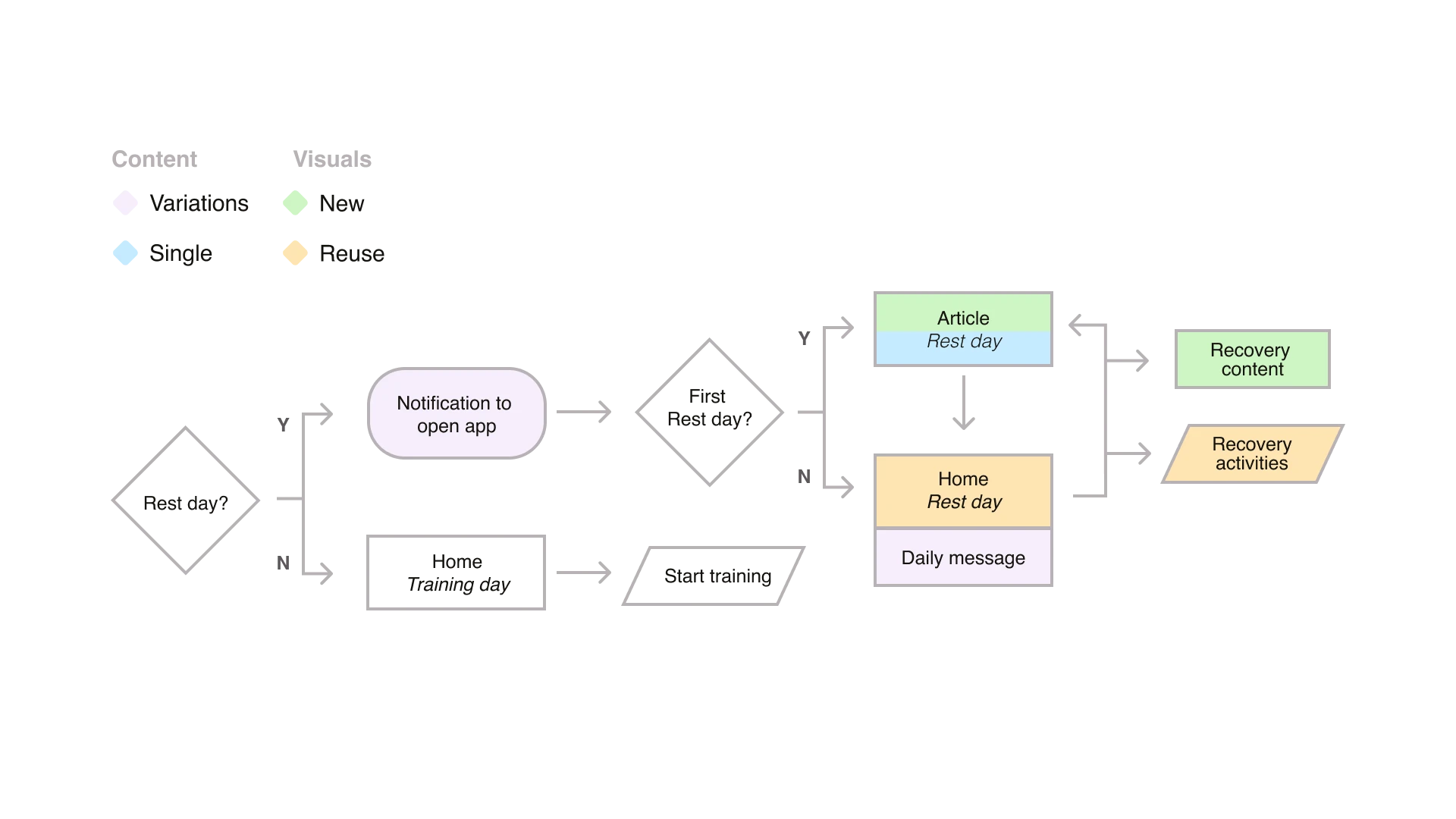
With the user flow ready, I could focus on writing and designing. I started with simple copy changes as they could have a big impact but they required minimal technical work, just some light logic updates.
Legend:
Content: 🟪 Variations 🟦 Single | Visuals: 🟩 New
🟨 Reuse
🟪 Copy: Variations
♻️ Feedback: Reduce character count
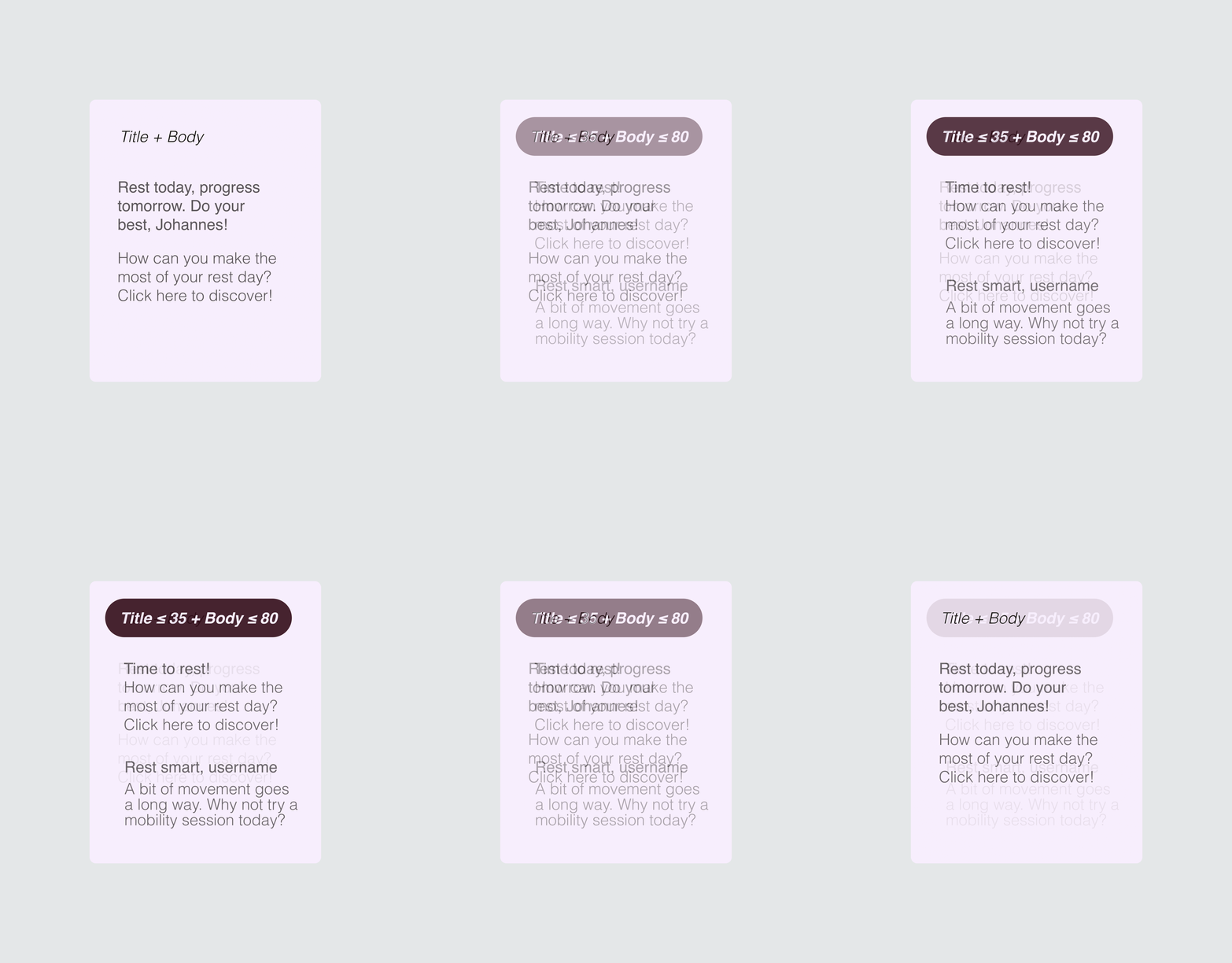
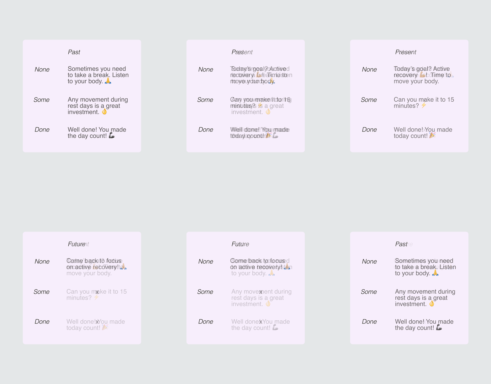
I wrote 10 variations of push notification variations that would encourage the user to open the app on their days off. From the initial drafts I got the feedback that they should be shorter so it wouldn't be cut off on the users display. I trimmed my notifications and set them up for localization.
🟪 Copy: Variations
♻️ Feedback: Increase varations
This message had to consider multiple scenarios, what if the user only trained for a bit?, and it had to be both encouraging and gentle. Users also tended to explore previous and future days in their calendar, so the message had to account for those cases as well. As final touch, we decided to include emojis to add a friendlier feeling.
👩🏽💻 Copy decision:
Keep content as short as possible yet encouraging
🟦 Copy: Single
♻️Feedback: Remove internal concepts
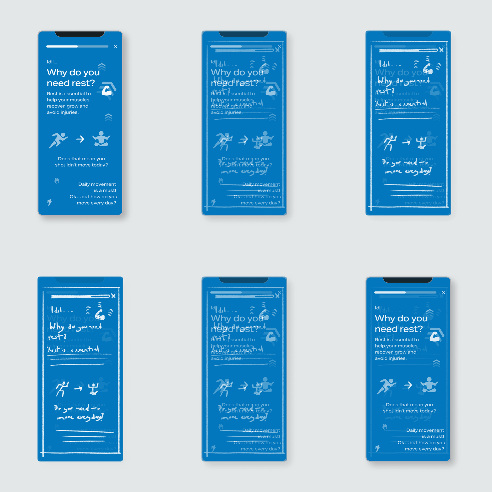
New users might know about active recovery, so we I wrote a brief article to explain why they should open the app on days off and what they could expect on said days. The article included lots of images and used highlight colors to indicate this was new content.
Originally we had planned to include an explanation to the internal concept of "Base" but it muddied the message and from user feedback we knew this term was already confusing.
🟩 Visuals: New
♻️ Feedback: Reusable layout
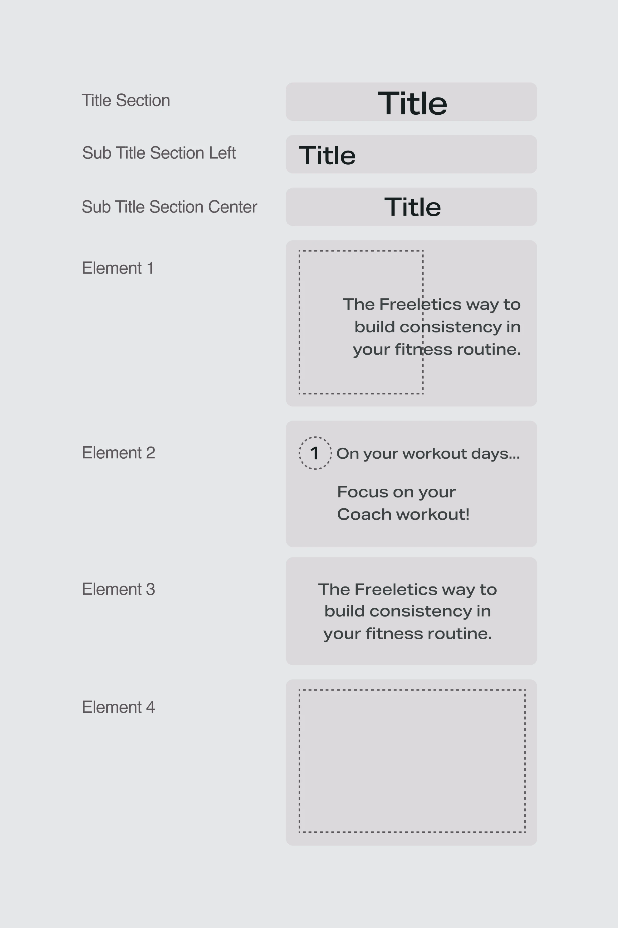
The article had to stand out, I designed a new type of layout that would allow for easy reading with lots of images. We could reuse this same layout when talking about new product features or other interesting concepts or announcements for users. To make sure it would be easy to build and use, we created a standarized layout that content writers and designers could utilize.
👩🏽🎨 Design decision:
Create resusable components for other designers to
use
🟩 Visuals: New
♻️ Feedback: Easy access to articles
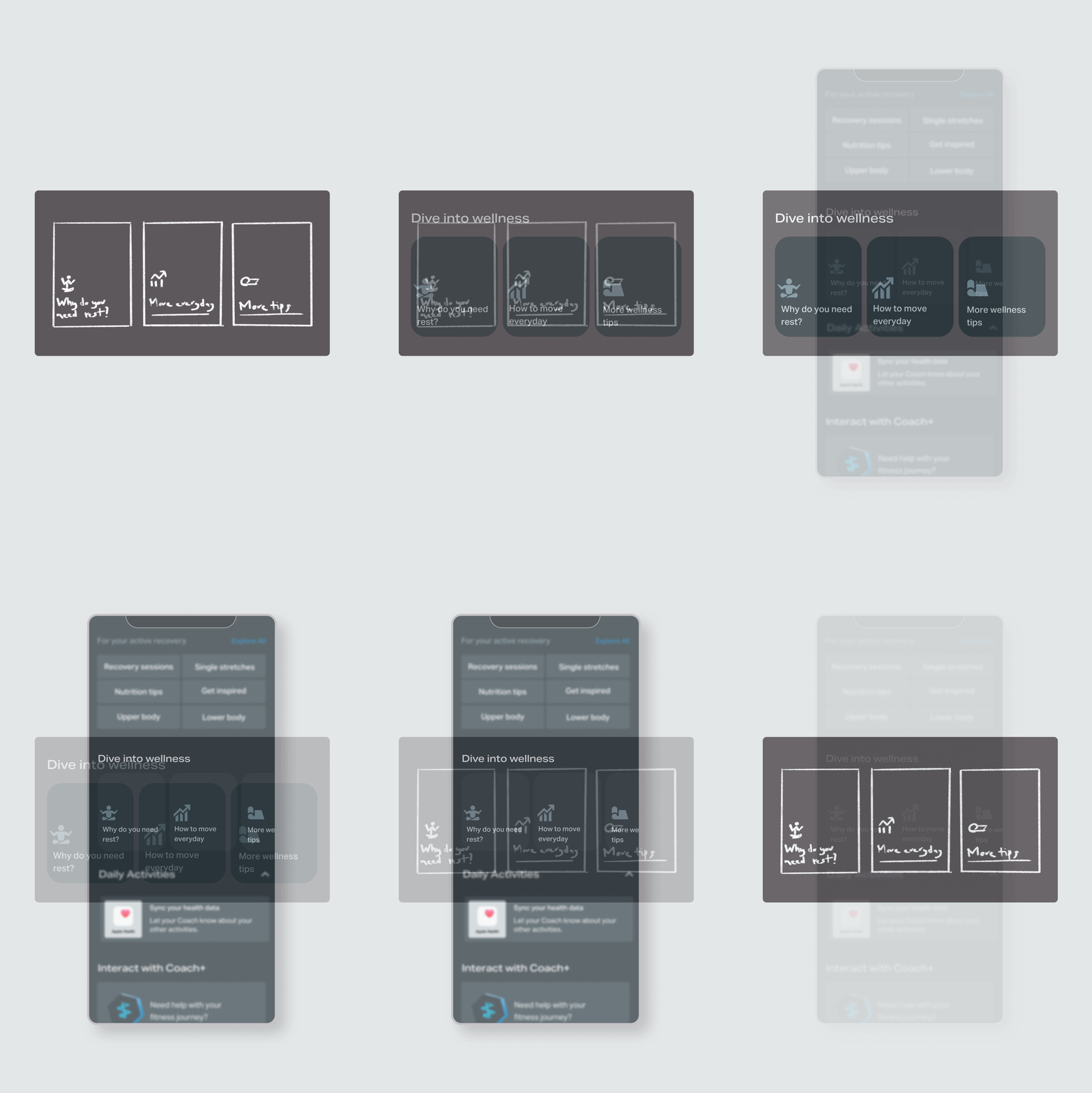
The next question we had to tackle was: how will users access the articles again? Since we had planned to write content for different concepts and features in the app, we needed to show them in a way that would standout from the other quick links section. For this we planned simple content cards that would only appear on rest days.
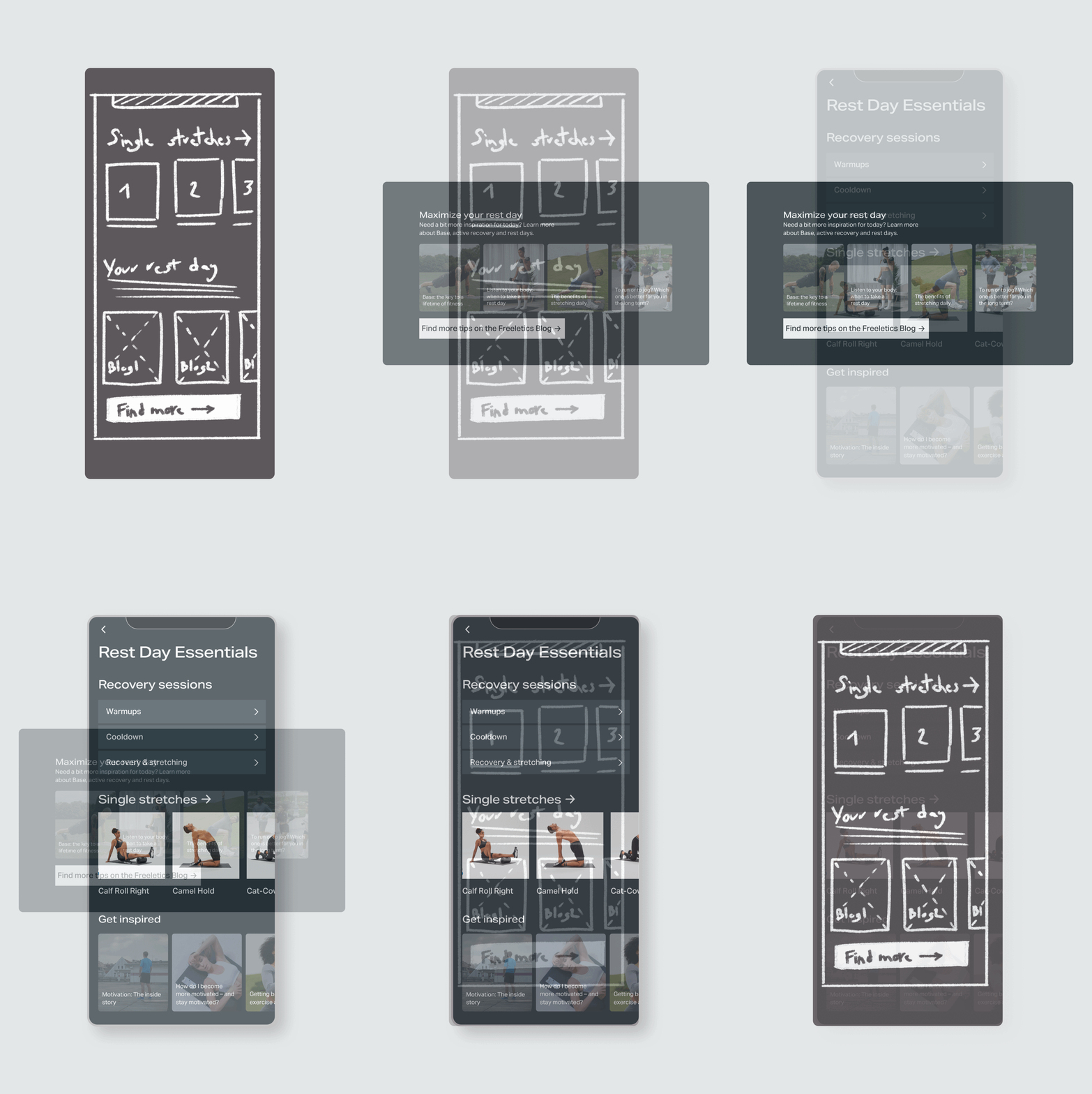
🟩 + 🟨 Visuals: New + Reuse
♻️ Feedback: Next iteration
To support rest days, we decided to repurpose the “Explore More” screen. This section already featured workouts and single exercises, so we brought cooldown and warm-up routines forward as initial suggestions.
We also proposed a new feature to surface blog articles using their images as backgrounds. While effective, this added content management complexity, as articles would need regular updates. We included it in the prototype as a proof of concept, leaving full implementation for a later iteration.
🟨 Visuals: Reuse
♻️ Feedback:Lack of longer routines
The final step was replacing the quick links on the home screen. This required minimal technical effort, as it reused an existing feature. The main challenge was selecting which recovery links to display, given our limited content. For the prototype, we showcased the ideal set of links to guide users toward the “Rest Day Essentials” screen and strengthen the proof of concept.
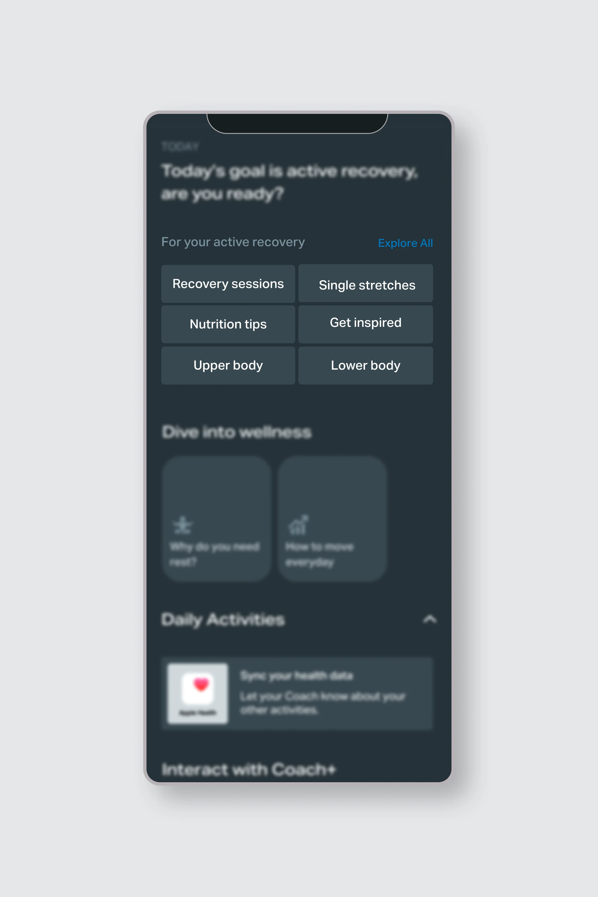
I created a high-fidelity prototype that incorporated as many final design elements as possible, using a combination of existing features and updated copy to simulate the intended experience. The goal was to maximize the value of user testing, even if some features were planned for later implementation. Users could navigate through the calendar, view rest day content, and explore a curated “Rest Day Essentials” section—built by repurposing the existing “Explore All” screen and populating it with blogs and recovery routines.
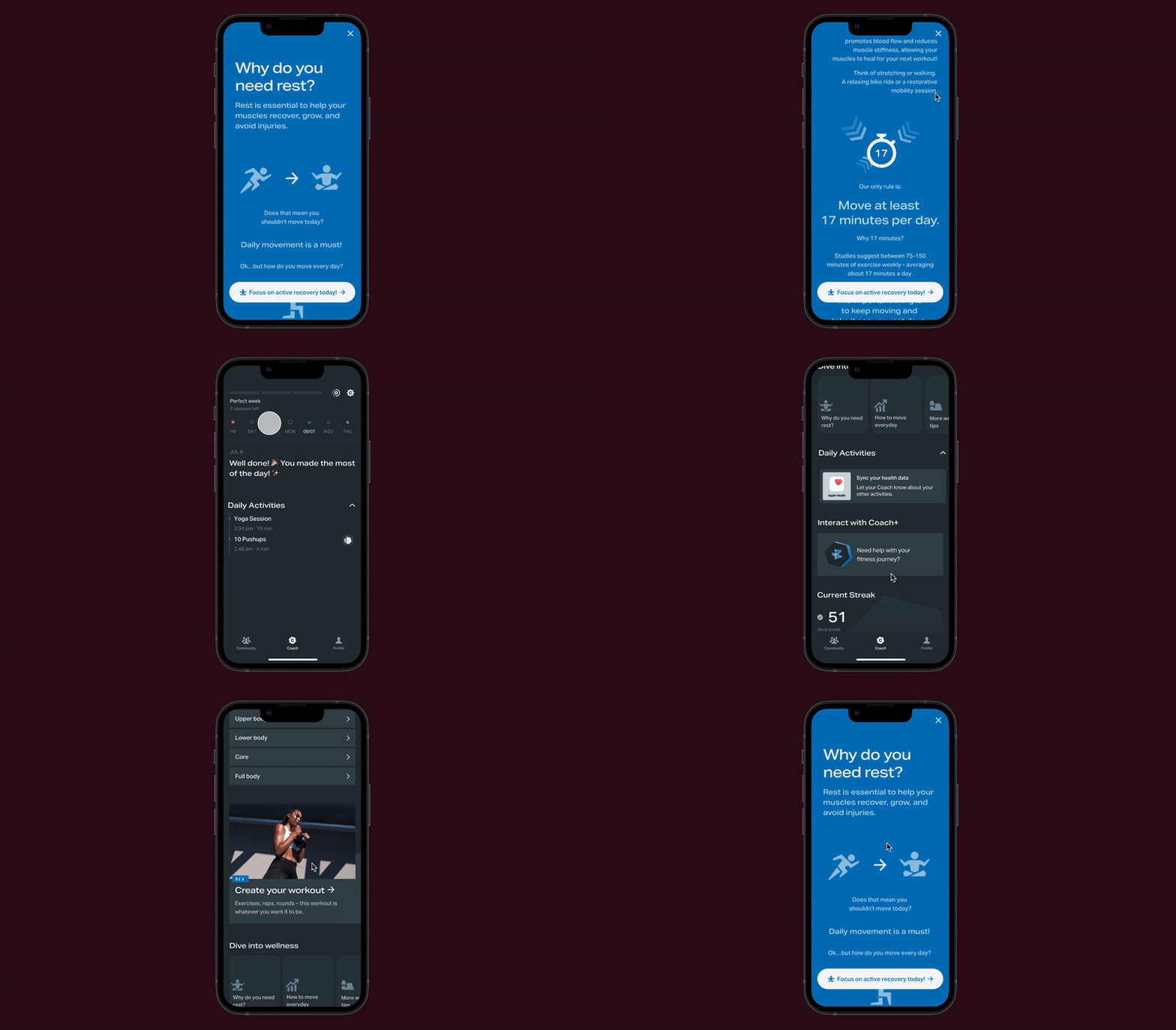
👩🏽🎨 Design decision:
Create a very detailed prototype to make the most of
user testing
With support from our user experience researcher, we conducted a mix of moderated and unmoderated testing. We spoke to both existing and new users to understand their familiarity with active recovery and gather expectations around rest day experiences.
Our testing focused on content clarity, feature usability, and the perceived value of rest-day content. We conducted interviews with 10 users over two weeks.
Example participant subset

Existing user

Existing user

New user

New user
User response was overwhelmingly positive. Many participants said that the tone of the copy alone made a difference—it felt motivating, encouraging, and relevant to their needs.
9/10 said they would try a recovery session after reading the article.
7/10 described the articles as helpful or motivating.
2/10 had trouble locating the content again later.
5/10 spontaneously described the tone as “relatable” or “friendly.”
3/10 expected a push notification on their rest day (not yet implemented).
“If rest days can help me reach my fitness goals faster, I want to read tips on days off.”
The testing phase validated our concept. Users embraced the idea of rest days as part of their progress and felt the changes would enhance their overall experience with the app.

User sentiment toward rest day support was strongly positive.
📣 User feedback:
Users want a hollistic experience for their fitness
routine
Based on feedback, we introduced a small change—a “Rest Day Essentials” screen that surfaced pre-selected articles and easy access to recovery routines.
Most users expected a large, clear button to start stretching right after reading. Some explored additional content, while others preferred to stop after one interaction.
These insights helped us prioritize our next steps:
We also passed along a request to expand the library of recovery sessions. Current routines lasted less than 10 minutes. A future enhancement could tailor recommendations based on muscle groups trained the day before.
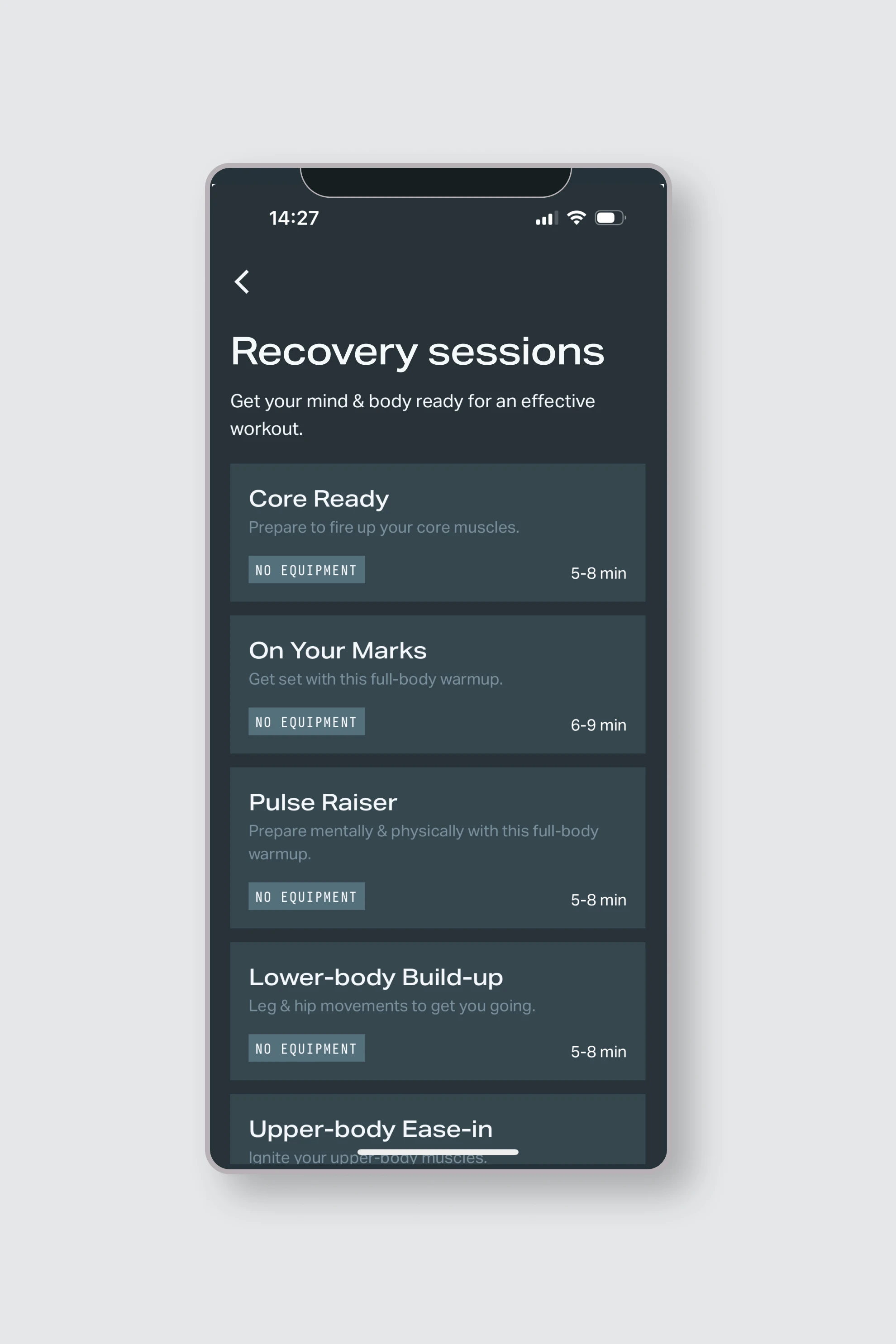
Stretching and recovery routines in use
🧘🏽♀️ Fitness content:
Include longer recovery routines for future
iterations
The team received a full handoff package, including finalized content and implementation-ready documentation.
The team is currently working on the first version of this update, with future iterations already scoped. An A/B test is planned to validate performance and inform next steps.
Success metrics include:
This project laid the foundation for long-term improvements, giving users more value on their off-days and helping Freeletics build a more holistic experience.
This project was a chance to deliver meaningful improvements under tight timelines—refining a strategy for rest days, testing a lightweight prototype, and delivering concrete copy and UI updates that made the experience more supportive.
If we want users to come back, we need to give them a reason—especially on their recovery days. With a bit of empathy and the right content, even small changes can spark new habits.
🔭 Closing statement:
Small copy changes can have huge impact in the
user's experience and behaviour