
My team and I explored how to keep users engaged on their rest days by creating a new content experience for the Freeletics app. I worked on the concept, copy, strategy, and UX/UI design to make off-days feel valuable. The goal was to keep users engaged and motivated even when not working out. Through some small redesign changes and precise copy edits we gave users helpful tips to fuel their recovery and increase app opens.
Freeletics, a fitness app with 59 million users, is great at helping people reach their fitness goals. Through personalized workouts, tailored to your schedule and available equipment, the app is there to make you the best version of yourself.
But what happens on your days off? If you’ve scheduled three morning workouts a week, what keeps you coming back on the other four days?
This was long-standing gap in the app:
how might we bring users back during their rest
days?
This was a tricky challenge as it needed to account for multiple stakeholders, technical constraints, and tight deadlines.
Users don’t open the app on days off.
What, Who, Why?
Scope
External + Internal
Solution
Feedback+ Iterations
High fidelity
Users new + existing
Final files
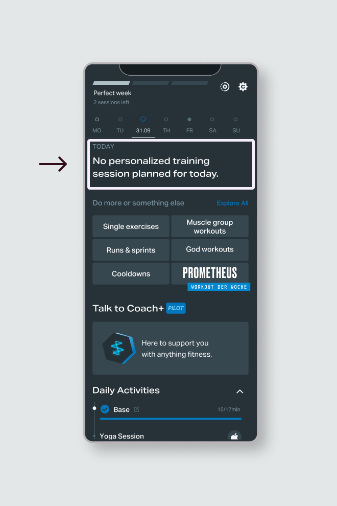
On days off there was little guidance on rest days, the app felt empty. No encouragement, no suggestions, and no reason to return.
We dug into community feedback and started to see patterns:
“I just follow the training plan. On rest days, there’s nothing to do.”
“My schedule is already full. If I’m not training, I’m not opening the app.”
“I’d love to do some recovery, but I don’t know what’s helpful.”
🔎 Research: Amplitude, Surveys, Customer support feedback
From our initial research, we landed on three key insights:
As a Freeletics user myself, I felt it too. On rest days, I missed the same guidance and encouragement that’s available during workouts.
Users needed support on non-training days.
This became the foundation for the Rest Days concept. It aimed to shift the experience from "nothing to see here" to "here’s something gentle, helpful, and supportive." You don’t need to train every day. But if you want to keep the habit going or ease sore muscles, here’s how to do it with care. The goal was to build consistency, not intensity.
This was especially important since according to our user segmentation, 73% of our users thrive on external motivation and is more likely to disengage without regular touchpoints.

Source: User segmentation survey
Training day vs non-training day
I knew from the start I couldn’t fix everything. Freeletics already does a good job supporting self-motivated users on training days. My job wasn’t to redesign the core workout experience, it was to improve the off-days. I had to set clear boundaries.
So I framed the problem as:
increase app opens on rest days without contributing to user burnout among our biggest active segment?
With this in mind, I studied the app, where could I
have the biggest impact?
The home screen is at the heart of the experience,
this is where users access their workouts and can
browse the calendar to see what other routines they
will have later in the week. Since we had to
consider a very limited implementation time, any
edits proposed had to be very precise and repurpose
some of the existing features.
I noted what I would focus on and what I would avoid:
To understand where Freeletics stood in the broader landscape, I ran a quick competitive scan.
What are similar apps doing?
🔎 Research: Competitive analysis
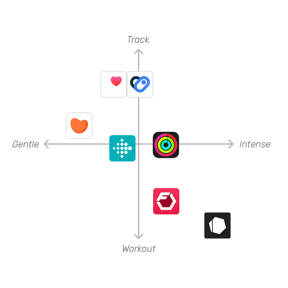
I looked beyond workout-specific apps. Google Fit and Apple Health stood out for a different reason: they track activity continuously, not just during workouts. This makes it easier for users to feel like “something counts,” even if they’re just walking the dog. I also browsed forums and noted what users were commenting:
“I went 4 months without a rest day. May came and I said screw it. I can’t keep it up for a year. Kind of deflated but whatever. I’m not a bot.”
“... I never try to close all my rings on Sunday. That’s my rest day. I don’t really care about maintaining my streak but a lot of people do.”
🔎 Research: Browse forums, Review apps
This stuck with me. People want consistency, but not at the cost of burnout. They want permission to rest, not pressure to perform every day.
Apps like Gentler Streak and Fitbit offer a different approach. They treat recovery as part of progress. They suggest lower-effort activities when your body needs rest and offer recovery tools right alongside more intense training options. They reflect a more holistic view of fitness. Freeletics should offer that kind of support too.
I summarized all my external research into a few key insights:
Since I wanted to take advantage of as many existing materials as possible so I approach our internal content review with 3 key words in mind: reuse, repurpose and rewrite.
Beyond workouts, the app also offers stretching and cool down routines users could do on their rest days. I also noted gentle warmups that could be featured as active recovery.
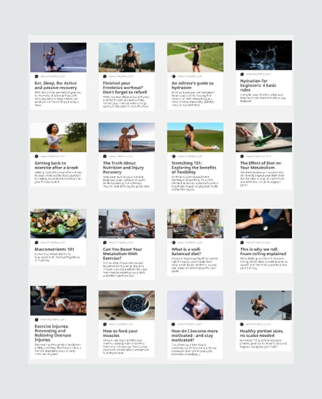
The Freeletics website has an extensive blog catalogue with more than 1000 articles. The topics range from fitness tips to recipes, having had worked on classifying and tagging them for a previous proyect, I curated a selection of articles we show users on their rest day.
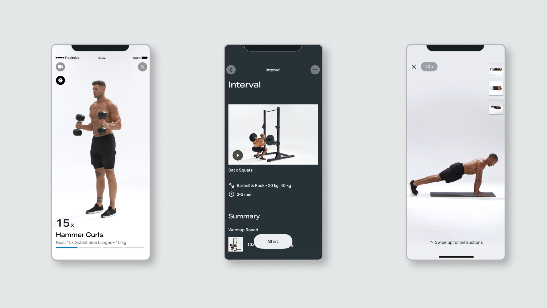
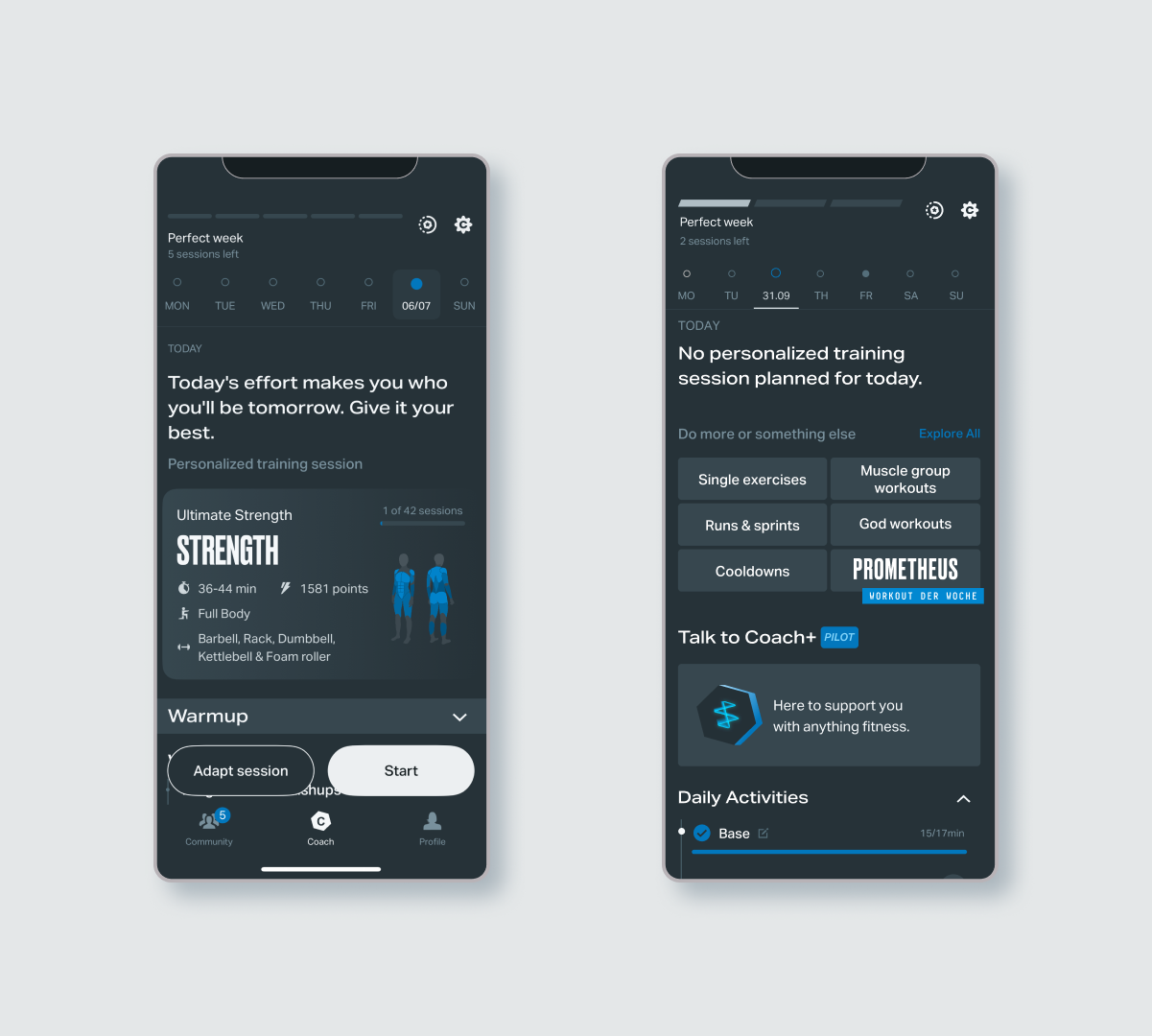
The home screen was divided into several sections, at the top a bar displayed the Perfect Week tracker alongside access to settings and calendar navigation. This was followed by a daily message and a personalized session section, which included a breakdown of the warm-up, workout, and cooldown. Below that were quick links to single exercises, signature workouts, the create-your-own option, and the workout of the week.
🔎 Research: Notes on home screen, Input from PM
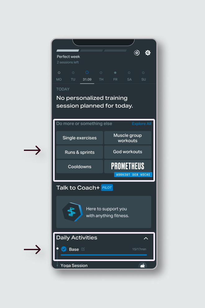
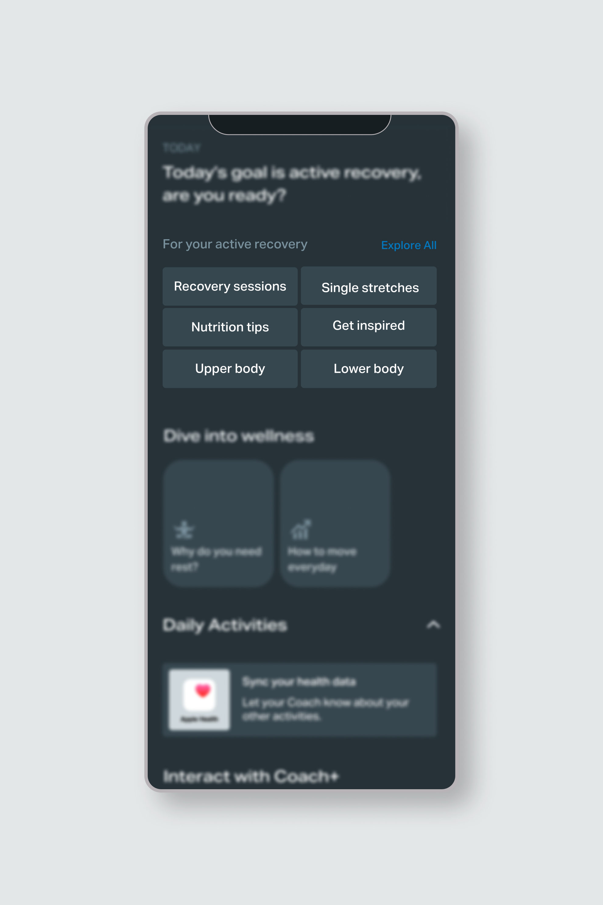
Quick links and Daily activities would be the most useful sections to tackle. The first one could display links to relevant blogs and gentle recovery routines while daily activities could provide a summary of all active movement the user had done, even outside the app.
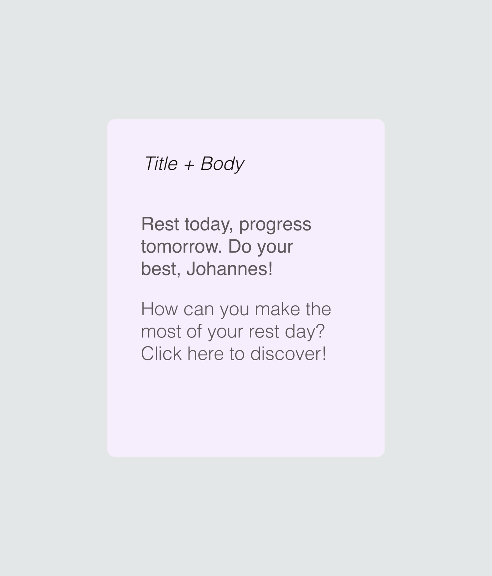
When thinking about what copy changes could have the biggest impact, the daily message was the clear solution.This is the first greeting users get when opening the app, the copy could be tailored to the activities they had done on previous days and encourage them to keep moving on their days off.
Recovery content designed for real life.
I wanted these changes to be part of a broader strategy, not just a one-off edit. The goal was to develop a plan that would encourage users to build their own fitness routines and establish healthy habits. The content needed to evolve in a way that gently nudged users toward habit-building, increased app opens, and minimized technical effort through simple content swaps.
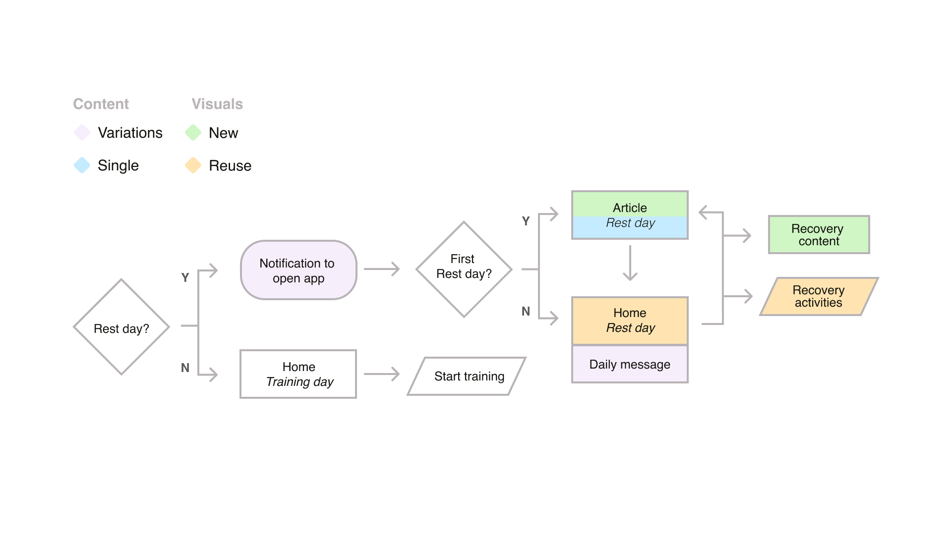
To create lasting impact, I placed myself in the user’s position: what kind of experience would I expect from the app on a rest day? How would that differ from a training day? Since there were no existing triggers to incentivize opening the app on a rest day, the first step was to add a push notification—something to let users know there was something waiting for them.
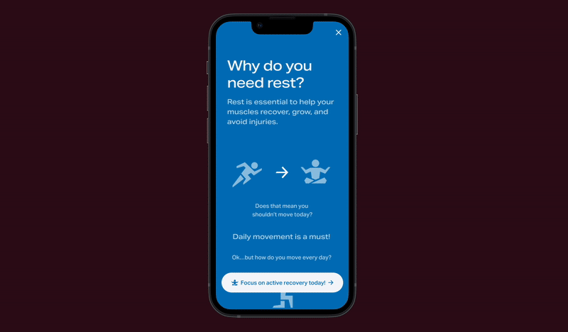
If it was their first time encountering the concept of a rest day, or if they were new to the app, they should receive helpful information about what to do. This was especially important for people new to fitness who might believe that on rest days, they should avoid moving altogether. These insights could be delivered in the form of a mini article accessible at any time.
From there, the home screen should offer an encouraging message about gentle movement. It should also link to rest-day routines and blogs with more details on active recovery, fitness, and nutrition tips.
I then mapped these expectations into a user flow, identifying what would require new copy (including single and multiple variations), and what visual changes could reuse existing components versus those that would require new features.
Once I had planned the user flow, I could focus on writing and designing. I started with simple copy changes as they could have a big impact but they required minimal technical work, just some light logic updates.
Push notifications and Daily message needed variations
The original plan considered all copy variations to be subtly change week by week to help the user establish habits, celebrating every progress milestone. However since this will increase the technical scope the idea was
Rest days introduction, feature cards, home of rest, update links
Copy: Variations
Feedback: Reduce character count
I wrote 10 variations of push notification variations that would encourage the user to open the app on their days off. From the initial drafts I got the feedback that they should be shorter so it wouldn't be cut off on the users display. I trimmed my notifications and set them up for localization.
Copy: Variations
Feedback: Increase varations
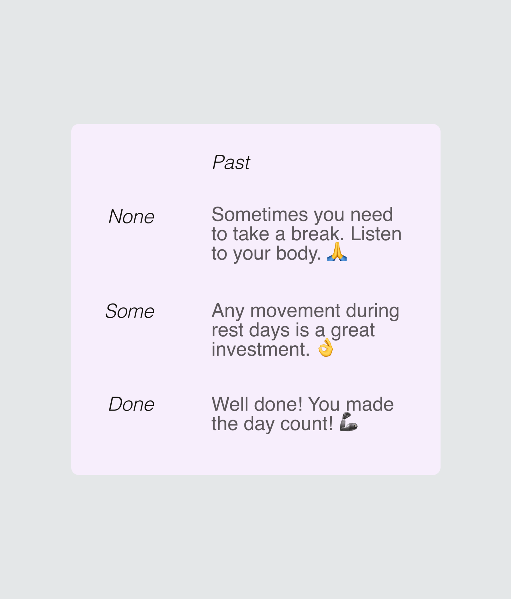
The daily message welcomes the user to the app had to consider multiple scenarios, what if the user only trained for a bit? What kind of message should we have then? It had to be both encouraging and gentle. Users also tended to explore previous and future days in their calendar, so the message had to account for those cases as well. As final touch, we decided to include emojis to add a friendlier feeling.
Copy: Single
Feedback: Remove internal concept "Base"
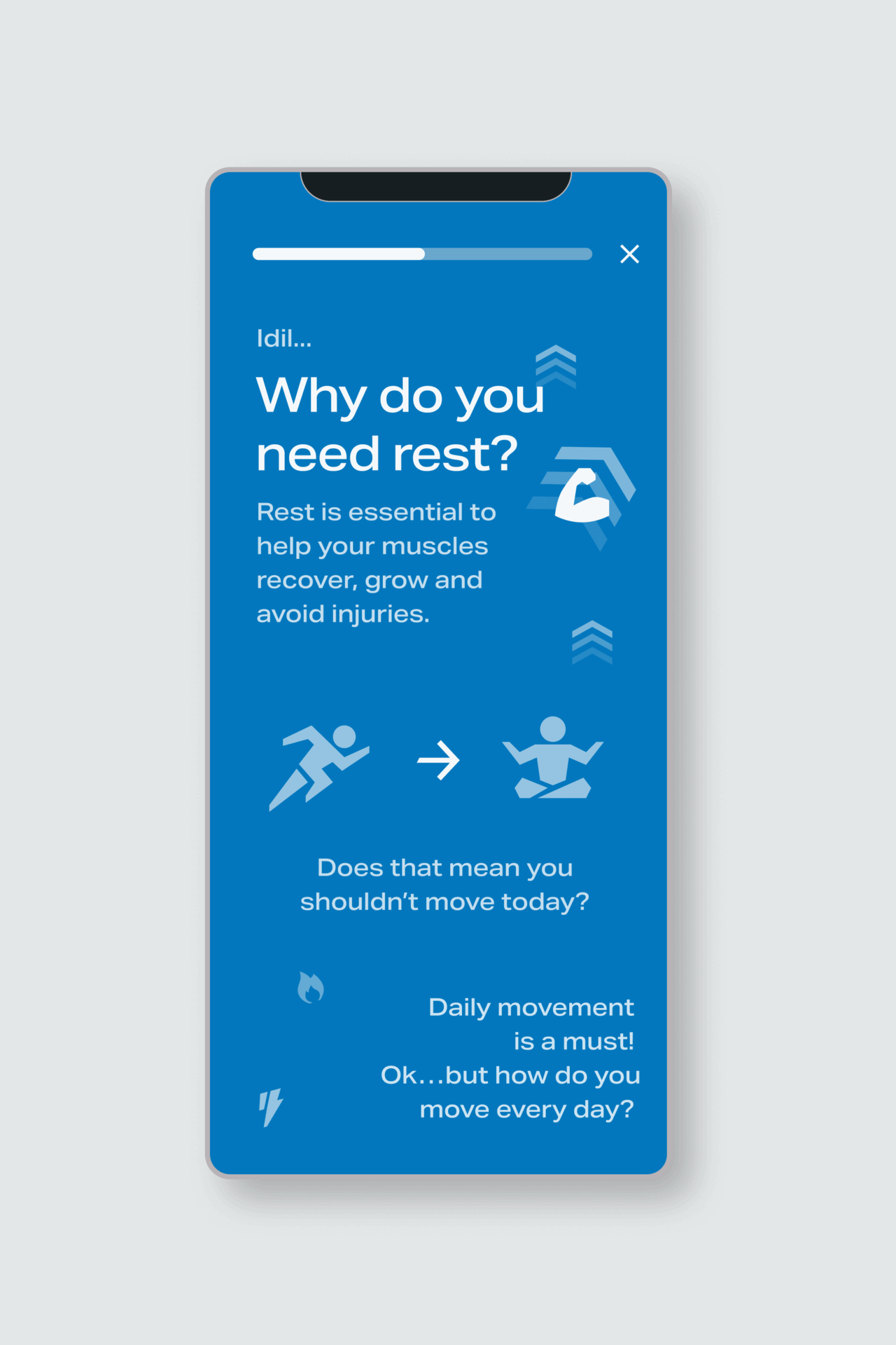
Users new to fitness might know the concept of active recovery, so we decided to write a brief article to explain why they needed to come back to the app on their days off and what they could expect on said days. Originally we had planned to include an explanation to the internal concept of "Base" but it muddied the messages and from user feedback we knew this term was already confusing so we decided to remove it.
The article was very brief and included lots of images, it also used one of the highlight colors of the app to indicate this was something special and new.
Visuals: New
Feedback: Create a layout we can reuse
Since the article had to stand out we wanted to place it a new type of layout that would allow for easy reading with lots of images. We could reuse this same layout when talking about new product features or other interesting concepts or announcements for users. To make sure it would be easy to build and use, we created a standarized layout that content writers and designers could utilize.
Visuals: New
Feedback: Easy access to articles
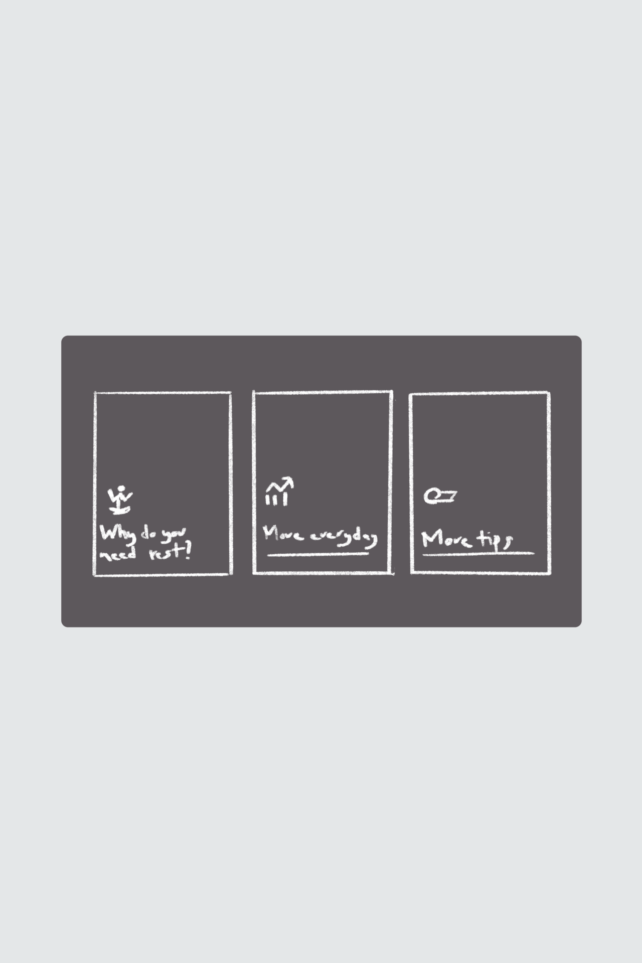
The next question we had to tackle was: how will users access the articles again? Since we had planned to write content for different concepts and features in the app, we needed to show them in a way that would standout from the other quick links section. For this we planned simple content cards that would only appear on rest days.
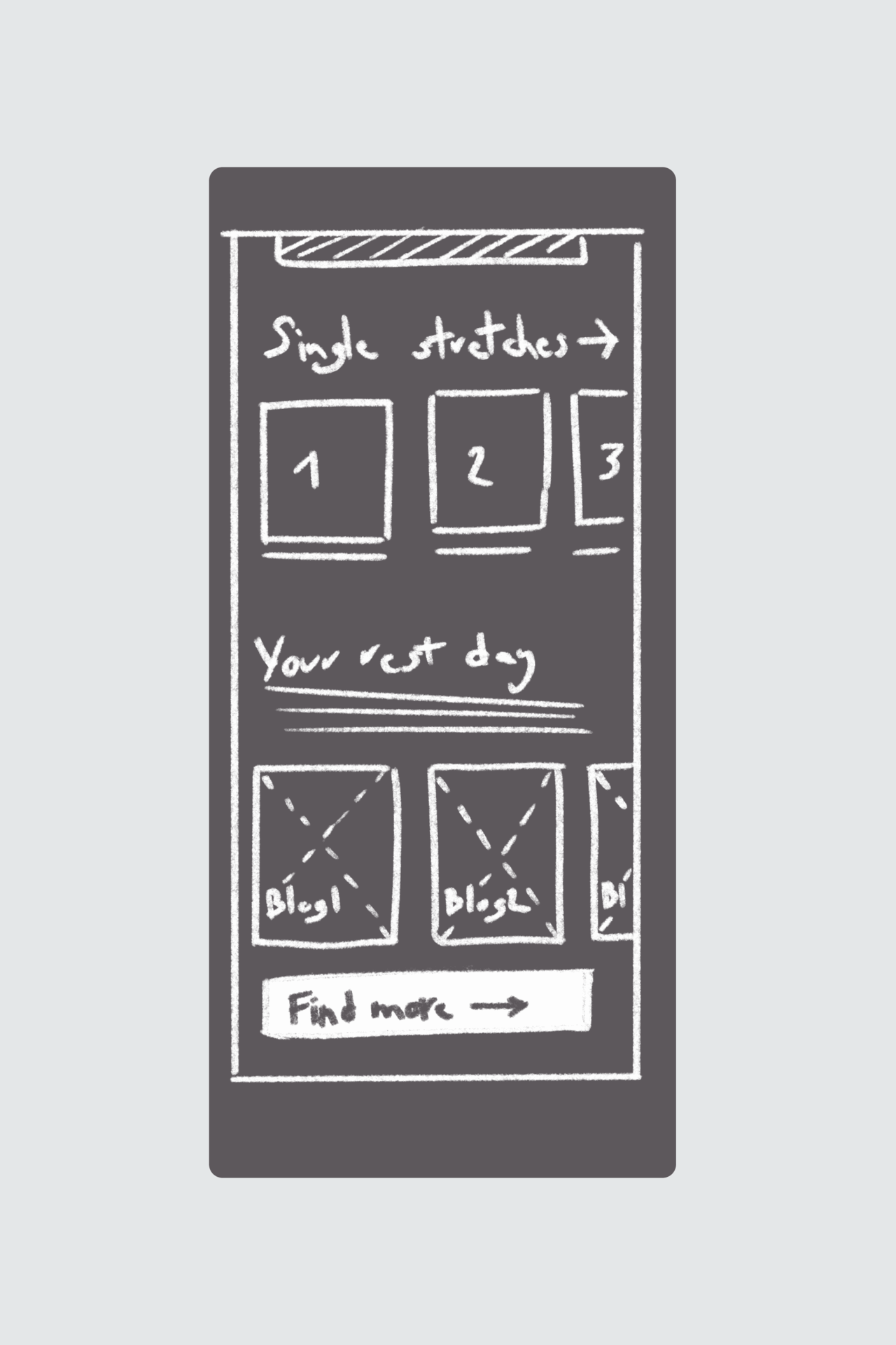
Visuals: New + Reuse
Feedback: Next iteration
To give users more content they could use during their rest days, we decided to reuse the "Explore more" screen. This screenhas links to other workouts and single exercises and we could bring forward cooldown and warmup routines as initial suggestions.
We also needed to create a new feature to show links to blog articles which would use blog images as a background. This however increased complexity as it would require constant content management to not bore the user with the same materials. We decided to build it for the prototype as a proof of concept and leave implementation for the next iteration.
Visuals: Reuse
Feedback:Lack of longer routines
The final step was replacing the links on the home screen in the quick links section. These would require very little technical work since it reused the complete feature. The only question was what links to place as we had limited recovery content. We decided to showcase the ideal links we would like to have for the prototype testing to let users access the "Rest Day Essentials" screen more easily and contirbute to the proof of concept.
Created a prototype that used a lot of existing features with the new updated copy. Users could navigate other days in the calendar and could also explore "Rest day essentials", which repurposed the "explore all" screen and filled it with blogs and recovery routines.
Guided rest days experience
With support from our user experience researcher, we conducted both moderated and unmoderated testing. We spoke to existing and new users to understand whether they were familiar with the concept of active recovery and to learn what they expected from the app on their rest days. We paid close attention to the content, the perceived value of the concept, and the overall usability of the prototype.
We interviewed 10 users in total in the span of two weeks.
Example subset

Existing user

Existing user

New user

New user
In both types of tests, users responded positively. Many felt that the copy alone made a significant impact, describing it as the right mix of positive and encouraging.
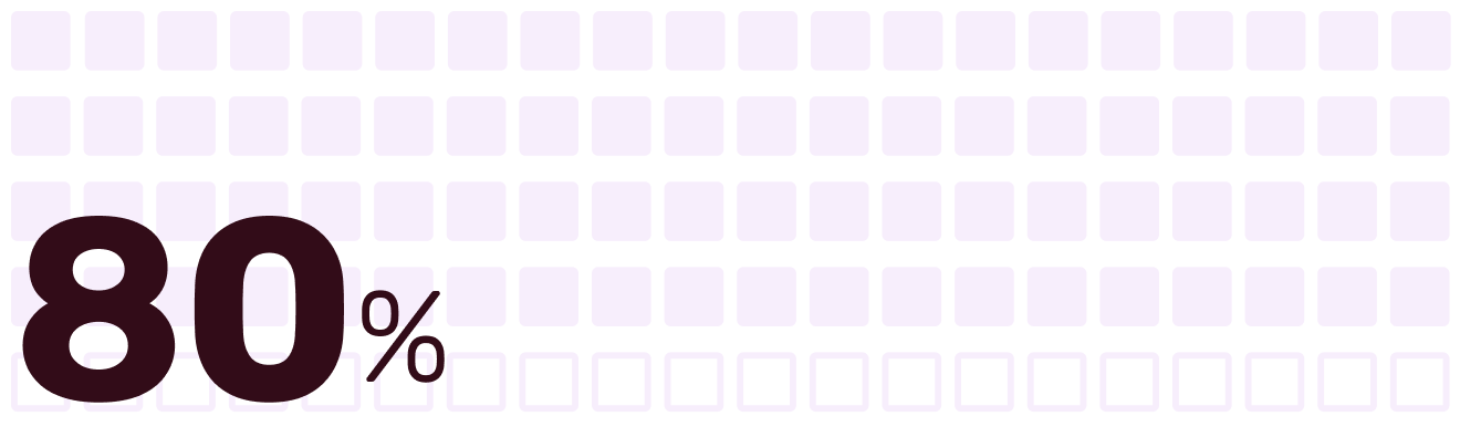
9/10 expected to do a recovery session after reading the article
7/10 said the articles were helpful or motivating
2/10 struggled to find the rest day content again
5/10 described the tone as “relatable” or “friendly” without being asked.
3/10 expected a reminder or notification on their rest day (not currently included)
“If rest days can help me reach my fitness goals faster, I want to read tips on days off.”
The tests proved to be successful, users were happy about the concept of rest days and felt it would elevate their training experience.
Users liked the concept of rest days.
We made one small change to the prototype to test the idea of a "Rest Day Essentials" screen where users could access a set of pre-selected blog articles and easier access to stretching routines. Users expected to see a large button that would allow them to start a recovery stretching session right after reading the material. Some users continued to explore from there, although others did not engage with the rest of the articles.
We took note of this and, depending on the results of further A/B testing, we planned to implement these updates in the next iteration.
User + Team feedback
We also noted to the fitness experts that we needed more recovery routines. The existing ones were functional but only lasted less than 10 minutes. Another suggestion for further iterations would be including routines targeted to the muscles the user worked out the day before.
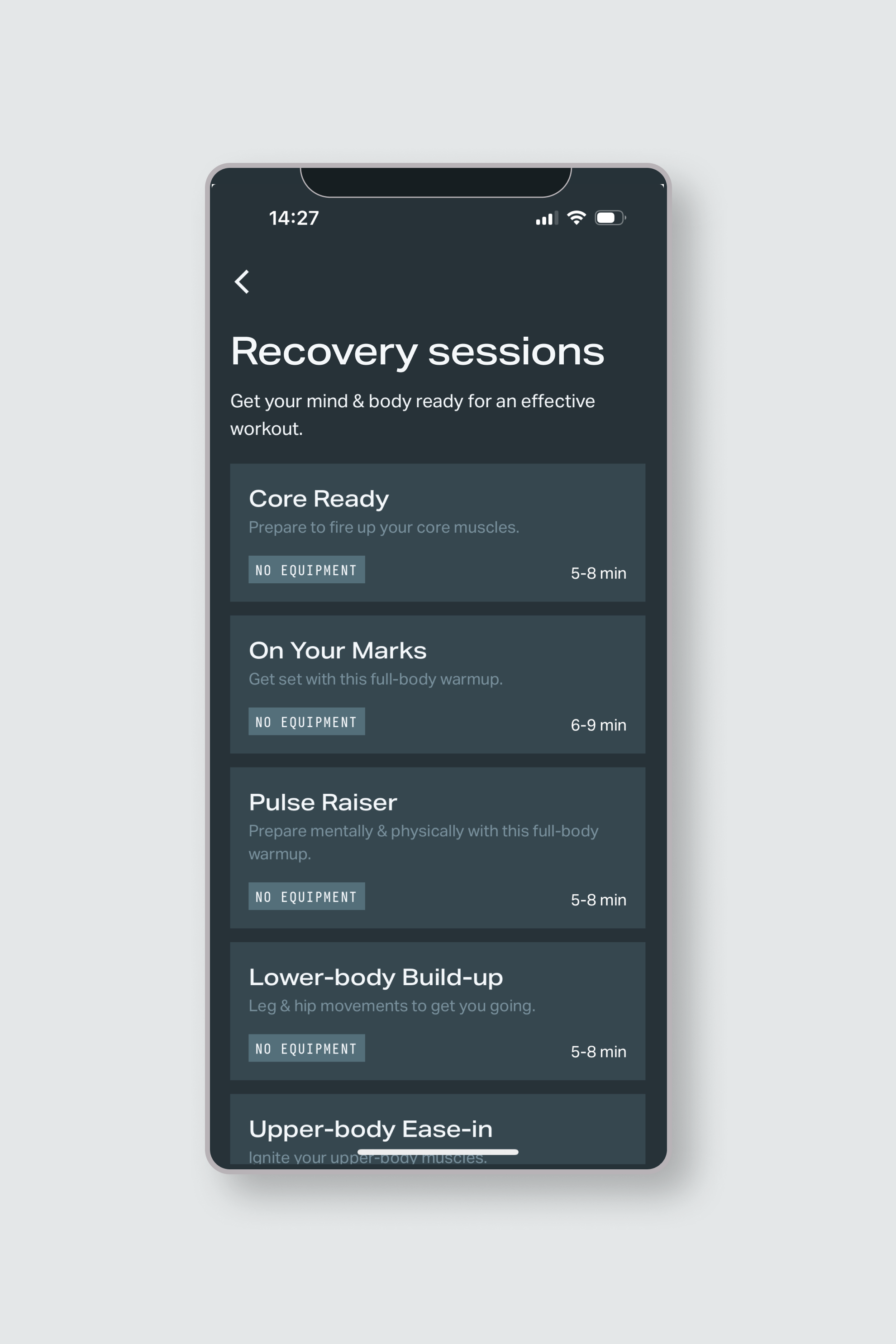
Existing recovery sessions
At the end the team received:
Written and submitted for localization
Documented for developers
We also created a list of features to implement in the next iterations:
Next steps would be starting an A/B test to see how real users would interact with the new messaging. With input from our Product Manager and the rest of the team we setup the following success metrics:
The project was setup for implementation but had to be put on hold since there was a different urgent priority in the roadmap. However documentation is ready to go for next steps in the near future.
This project was an incredible learning experience. Within a tight timeframe, my team and I created a strategy for rest days, tested and refined a prototype, and delivered concrete copy and feature updates. Together, these changes added real value and helped users feel more supported in their fitness journey.
Working on Rest Days reinforced the idea that introducing a new feature needs to be holistic. The original challenge came from wanting users to open the app more often—but we hadn’t given them a reason to do that on their recovery days.
There were no gentle stretching sessions. No encouraging messages. Nothing to reassure users they were still making progress. That left people feeling like they were falling short.
Through user testing and a lot of empathy, we focused on meaningful changes over flashy ones. Simple, thoughtful copy can do a lot. It can guide, motivate, and make an experience feel premium—when it’s rooted in real user needs.