Shapes of Data
Data • Design • Dataviz
Mar 18
A transformation challenge midpoint
check-in.
And looking at data in a different way.
I’m knee-deep in the Freeletic’s Transformation Challenge, nearing the halfway point. The finish line seems as close as the start and May can’t come soon enough, but by now, I know I can do it.
Measuring my portions, planning meals in advance, and packing snacks for every outing is second nature. I’ve learned to I have options in my fridge that simplify my decisions, I can simply pick which pre-portioned protein to defrost and turn into the star of my main dish. While all these mental calculations might feel like an extra burden to some (or a blessing for food over thinkers), one thing is clear: I am seeing results. I’ve lost quite a bit of weight, and there are some other side effects I was not expecting from following this specific diet.
Wait, aren’t you also working out? Yes, I’m also training hard! But tracking fitness progress is a bit trickier. I don’t test how many pull-ups I can do first thing in the morning. (Although my trainer would love that idea, so let’s keep this quiet.)
Instead, let’s take a look at the data I have been collecting and how some simple visualizations are helping me understand my progress in a new way.

Mandatory Jojo’s Bizarre Adventure post-workout pose
Methodology
If you know me or have come across my blog before, you know I’m a bit obsessive and love organizing things. So, it won’t come as a surprise that I have a spreadsheet where I track all my meals. (You can read more about it here: Transformation Challenge)
On this same spreadsheet, I also track my weight, body fat percentage, and water levels—plus total calories consumed per day and estimated meal costs. I keep adding more data and over time, this has evolved into a beautiful database with an ingredient list that includes costs and calories, meal breakdowns for easy comparisons, and my favorite: data visualizations.
To keep this database up to date, I
weigh myself every day and log
the data every few days. Sometimes, I even
plan meals in advance to help me use
up leftovers and
reduce food waste.
Do these
daily measurements pay off? Yes. How?
We have some trends to look at!
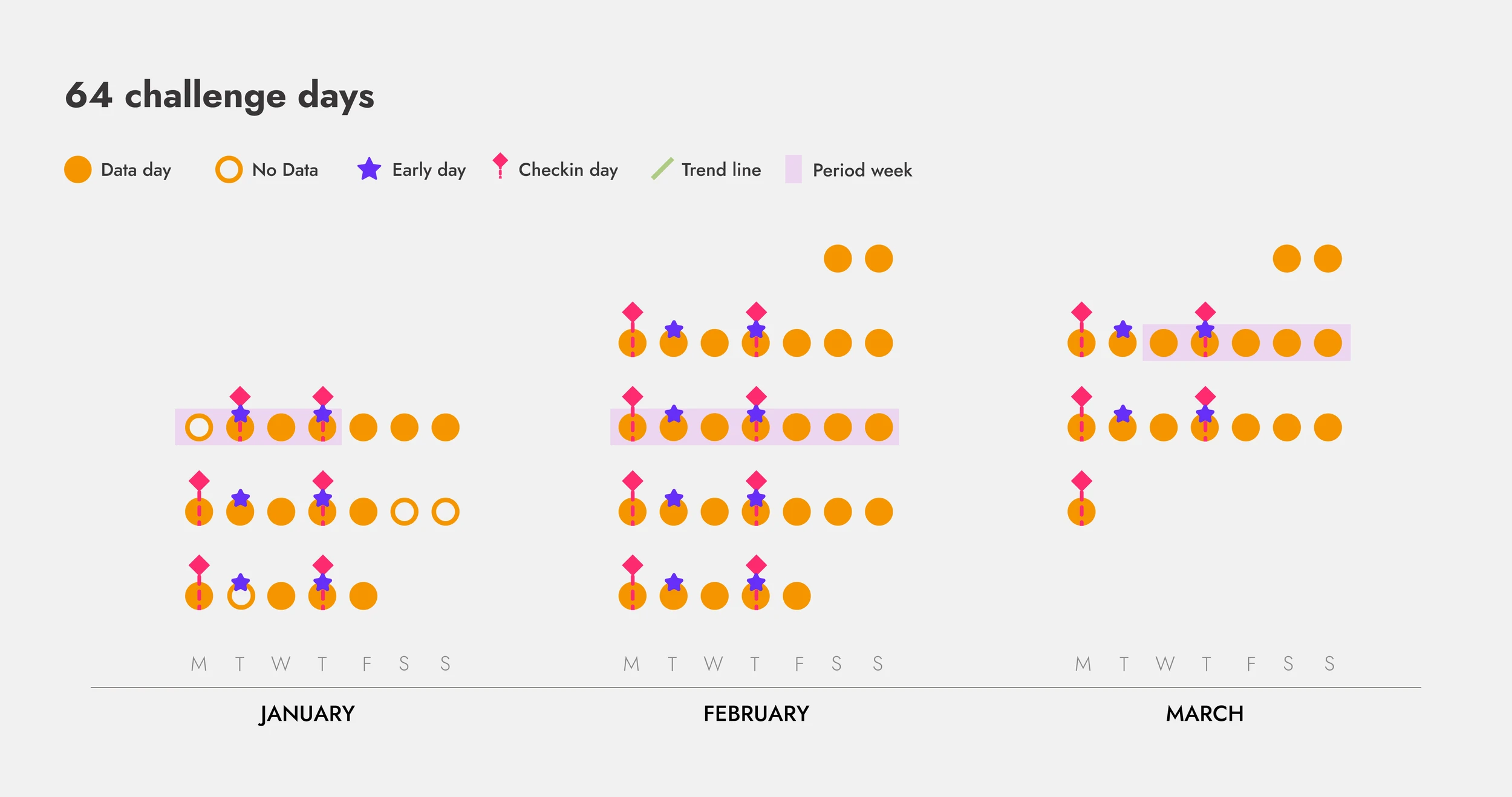
64 days of the challenge
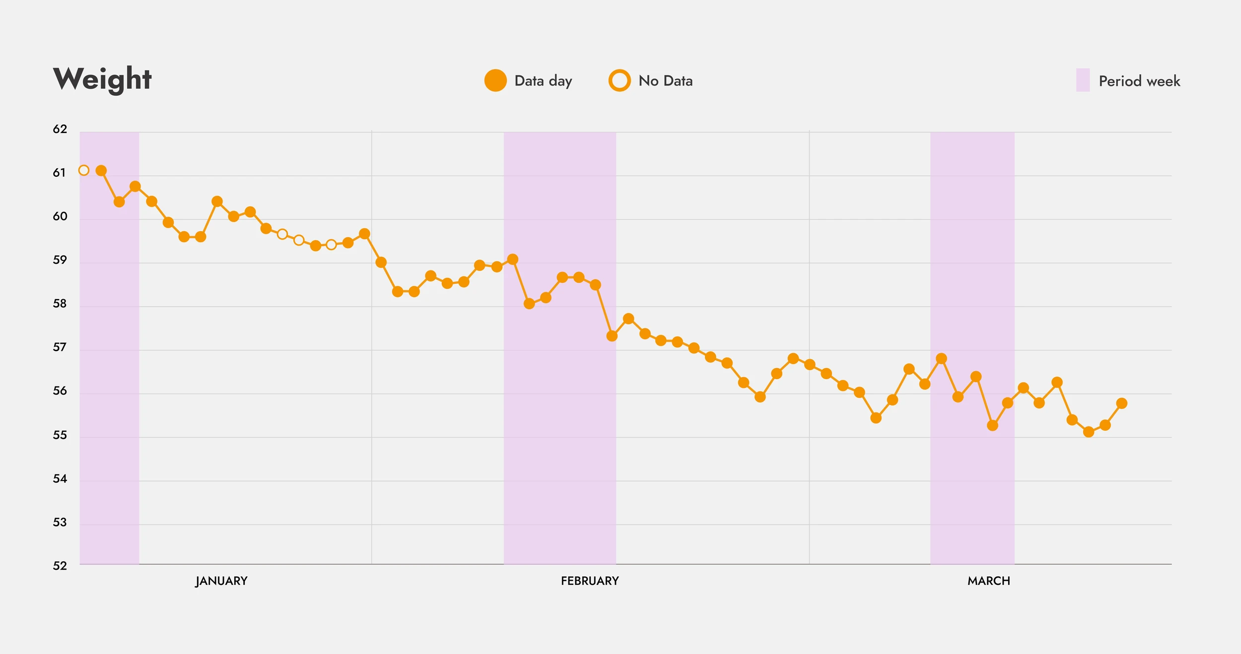
I started this program in January, and it’s now March. That means I’ve been doing the bootcamp for 64 days straight. How does this look in practice? Let’s use some dots to find out.
Each orange dot represents a day. The outlined dots mark days when I missed recording my weight but still followed everything else in the plan. (At the start, I hadn’t decided to track everything, but that quickly changed.)
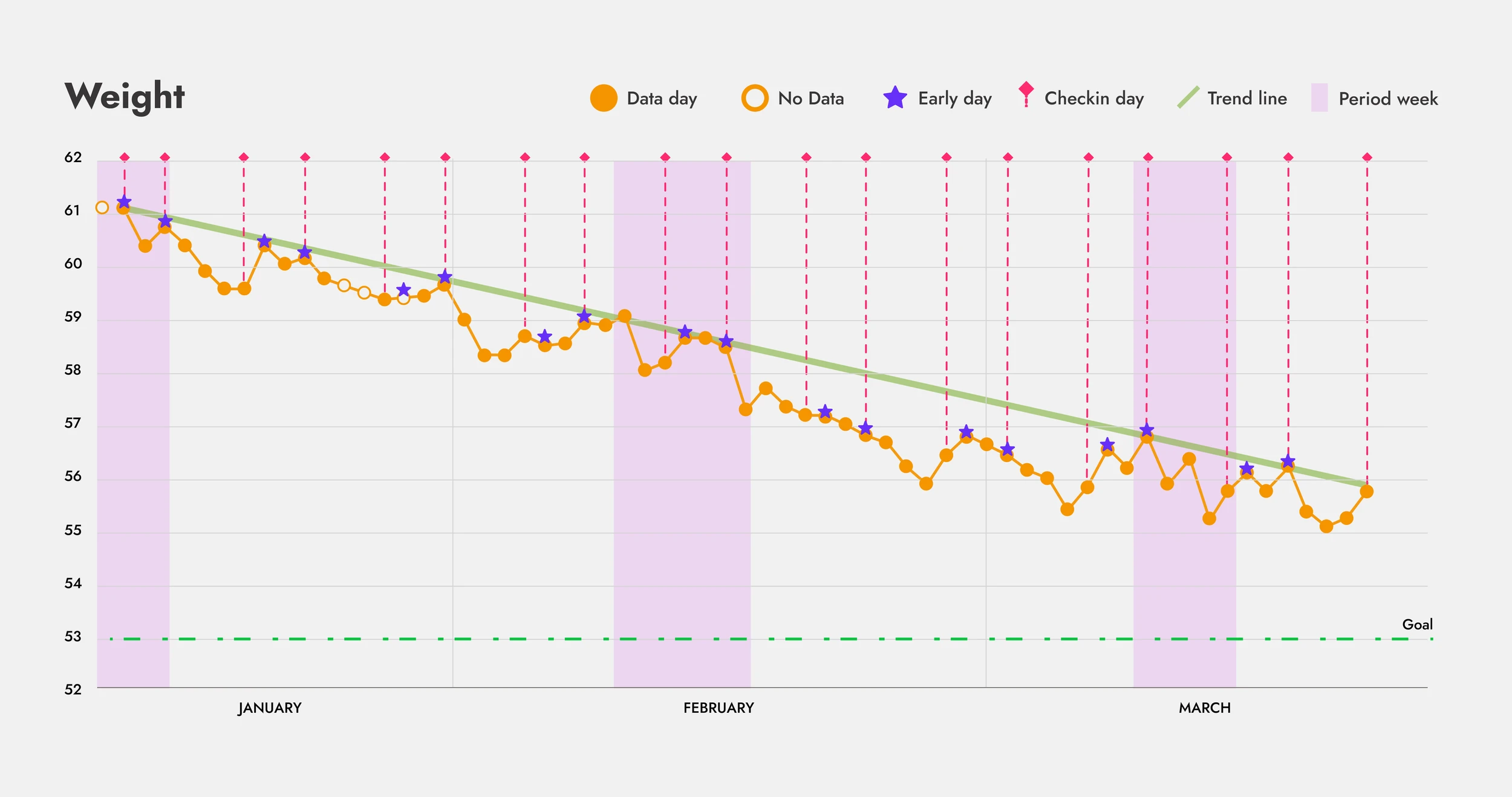
I work out four times per week. On Tuesdays and Thursdays, I have to wake up very early to join the team trainings. Let’s mark these days with a purple star. I’m not the biggest fan of early mornings, so I’m giving myself a star for accomplishing that.
My check ins with Sina, the nutritionist, are on Mondays and Thursdays. Let’s mark those with a pink dotted line. Nothing else to add here, except that I like pink.
Once a month, I also happen to menstruate for about a week or so. Thank you, Moon(?) Does that impact my weight? That week will be outlined with a lilac column. We're just missing the trend line in green, but for that, we need some data. Let’s do it!
How has my weight changed over this time?
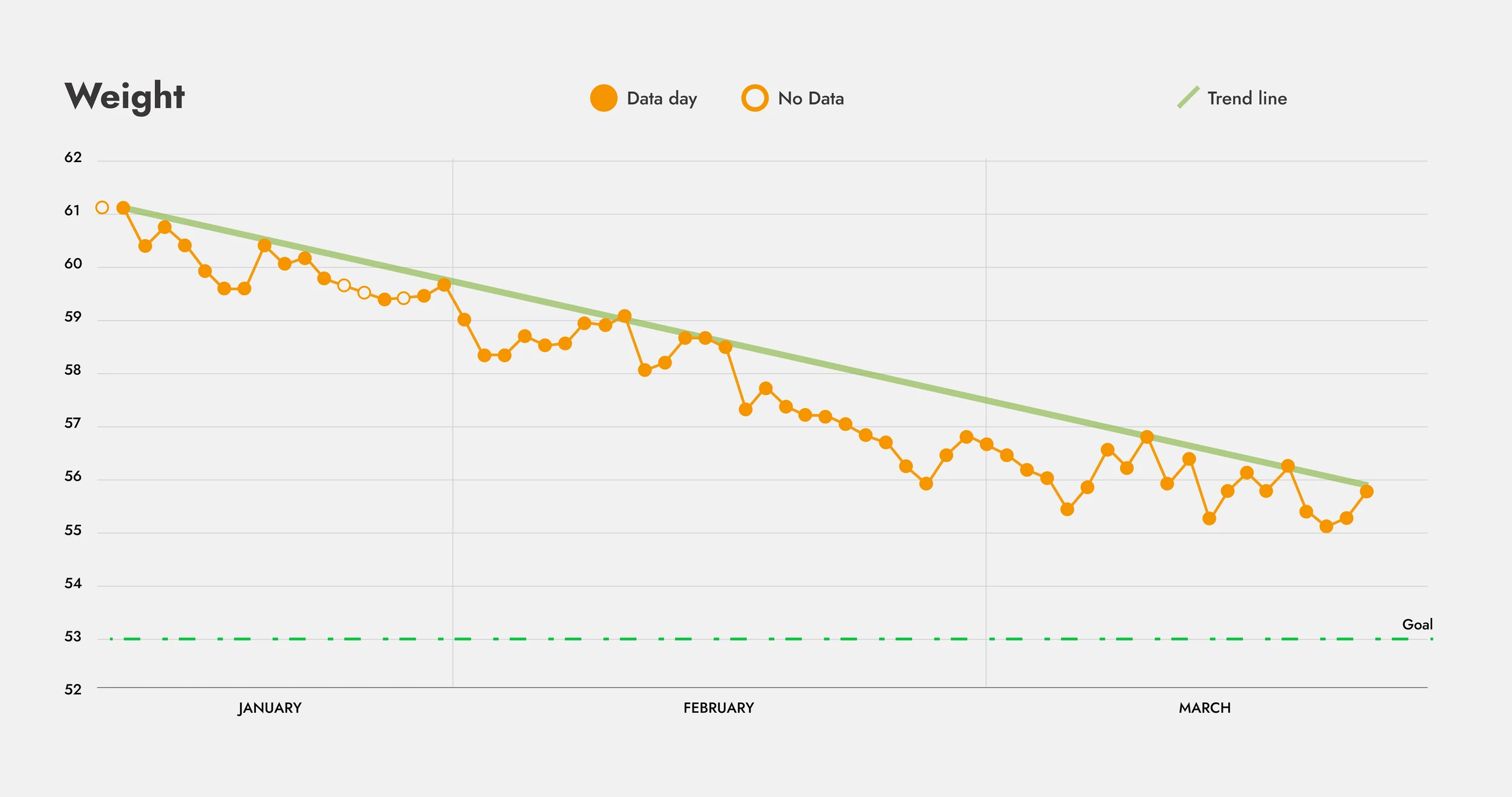
Daily weight measurements
My initial weight before bootcamp was
62 kg, and the week just before starting, it
was 61.8 kg. I felt pretty healthy, but I
didn’t have a clear
goal,I just wanted to see how far I could go.
After discussing it with Sina, we decided I
should aim to be between 53–55 kg. I set my
goal at 53 kg, ensuring my
body fat would be low while
leaving room to build muscle in the
final weeks of the challenge.
Looking at the data, there’s a clear downward trend, good job, me! But there’s also a noticeable pattern: my weight loss isn’t linear. There are peaks and valleys, and while the overall trend is positive, I would have missed this crucial information if I hadn’t measured daily.
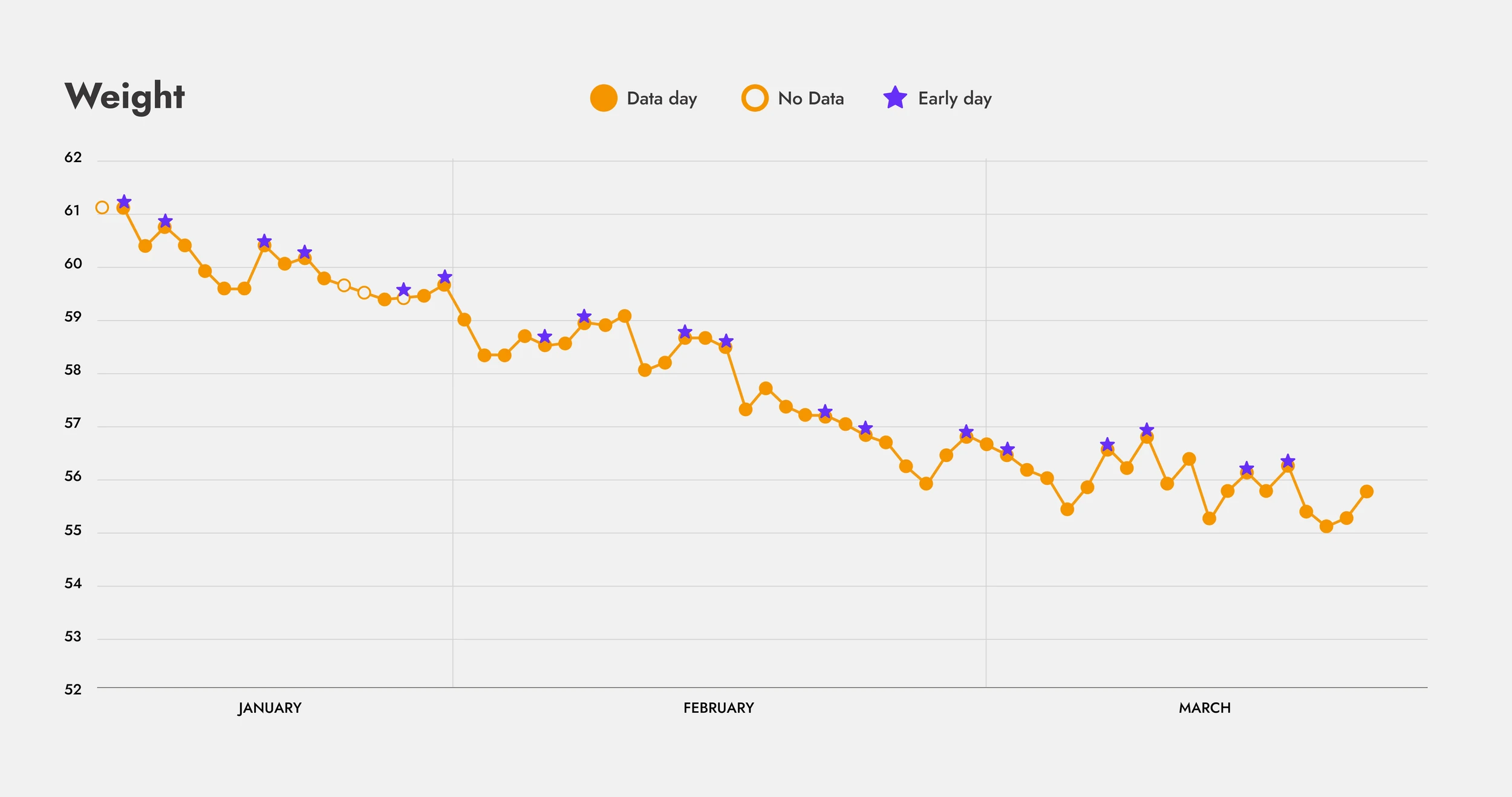
Early workout days
One thing is clear: waking up very early affects my weigh-ins. The days marked with a star (early morning workouts) tend to align with the high points on the graph. My lowest measurements, on the other hand, often happen on weekends, one or two days after the second star of the week when I’ve had time to rest and recover.
The challenge doesn’t explicitly ask us to weigh ourselves every day, but me being me, I wasn’t going to pass up the chance to track it in a spreadsheet. But what would have happened if I had only checked the scale when I thought I needed to?
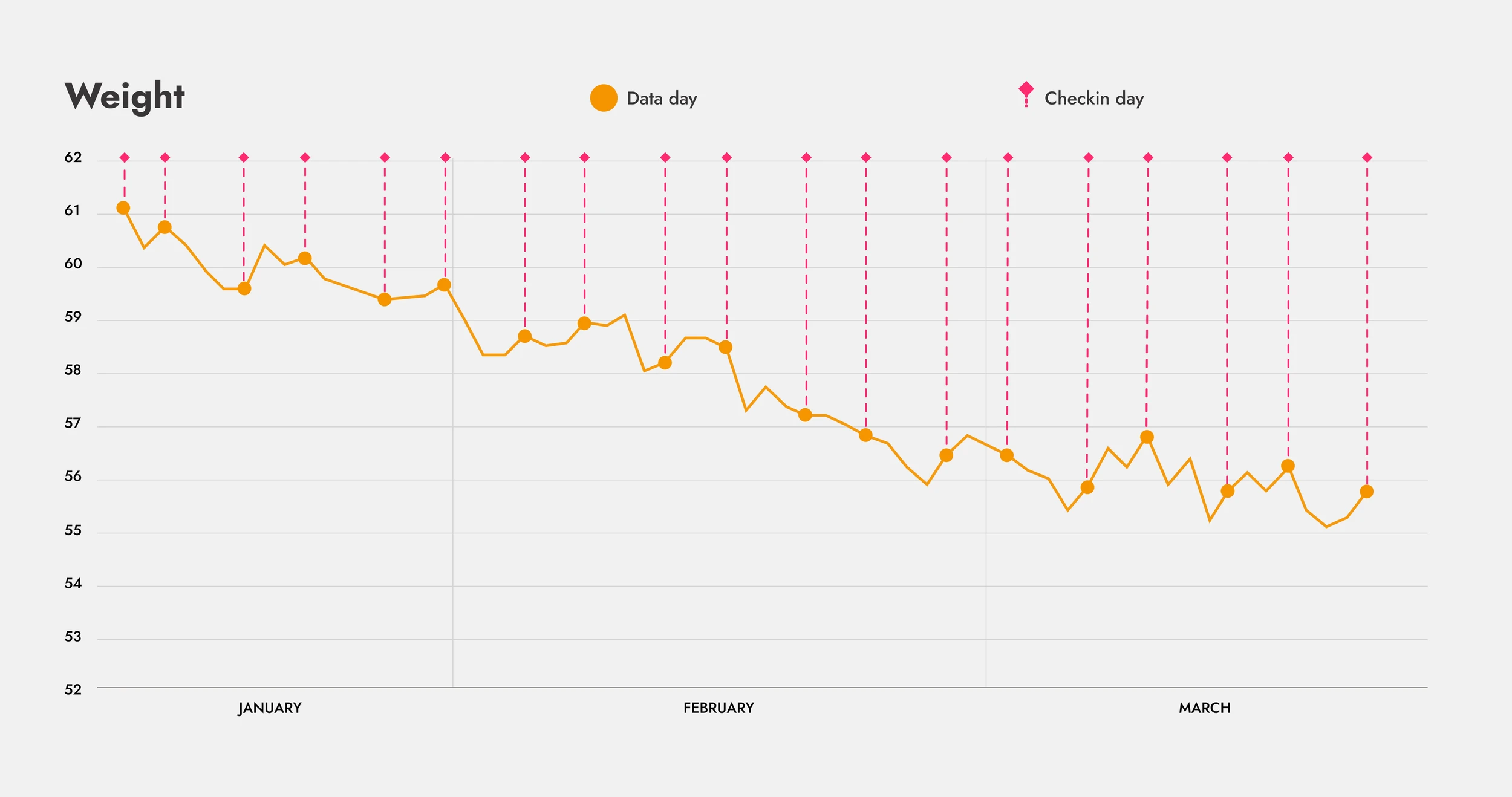
Checkin days
Looking at only the check-in days, I would have missed all the in-between changes! The line chart fluctuates quite a bit between those points. There’s also a clear pattern: I tend to weigh more on Thursdays than on Mondays. This could be influenced by having to wake up early on Thursdays compared to a slightly later start on Mondays. Even though I’m more rested at the start of the week, my lowest weigh-ins still happen on weekends, maybe because I’m more relaxed before the new week begins.
Could there be another factor affecting my weight? Maybe something happens at certain time of the month… let’s check.
Period weeks
Adding the days when I have my period (marked in lilac columns) reveals a possible pattern. In February, my weight started going up the week before my period, staying steady before dropping again. In March, though, the pattern was all over the place. There might be some influence, but the data is inconclusive—I’ll need a few more months of tracking to be sure.
All information in a single graph
There are also some positive side effects that are hard to measure. My skin looks much nicer now. I’ve always taken pride in my skin (My mom told me to care for it since I was 12. ¡Gracias, Mami! ) and I’ve been lucky with good genetics, backed by a solid nighttime routine. But lately? It’s so soft. Even my own high standards are impressed. This could be from cutting out refined sugar and sticking to a strict diet.
Another unexpected change is that I’m sleeping less. I feel more energized. Maybe it’s the habit of waking up early twice a week, but on days when I’d usually sleep in until noon, I’m up and about by 9 AM.
I’m really happy with these visualizations. Weighing myself every day can be a bit annoying, borderline obsessive, but it has shown me that weight loss isn’t linear. Many factors affect daily changes. If you want to be really extreme, you can even see the difference a few glasses of water make before stepping on the scale. Sometimes, weight follows simple science: calories in, calories out. Other times, there are “magical” things happening in the background.
So instead of obsessing over numbers, despite what my spreadsheet habits might suggest, I try to look at the bigger picture. The overall trend is good. I can be happy with that. Working on an obesity project (read more about it here!) a few years ago also shaped my perspective. Weight and health are more than just numbers. Hormones, stress, medication, and genetics all play a role. Even if diet and exercise are in check, fluctuations are normal.
I can use myself as an example. I’m strict with my routine, and these ups and downs still happen, it’s normal and it shouldn’t impact my overall progress.
Sometimes, data helps you be kinder to yourself.
That’s Enough About Me!
What do you think? What should I focus on next?
Did you like the data visualizations? What other data would it be useful to compare? Do you still want to see the food data base I am using to track my meals? Maybe I will talk about this next week…
Let me know—shoot me an email! 😊
📩
sifuentesanita@gmail.com