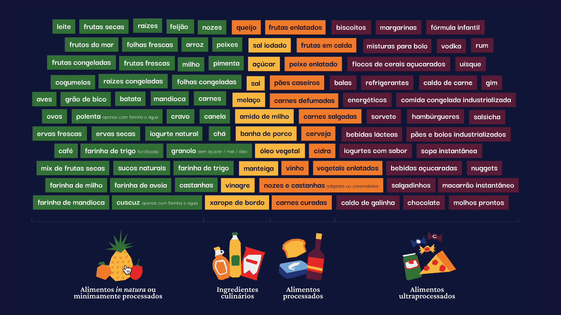
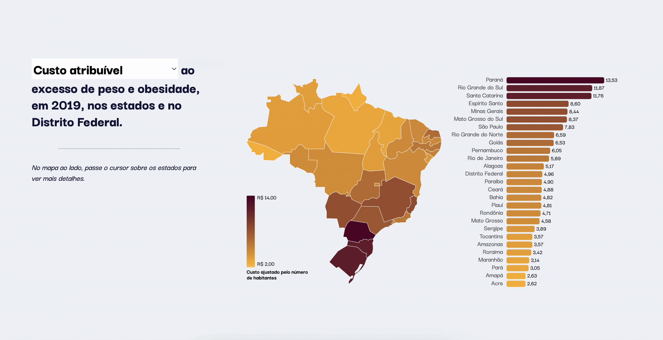
Obesity Epidemic

Transforming an article into an interactive data storytelling website

🌐 Outcome: Launched Website

  • Client/Team: Professor Rezende (UNIFESP), Odd Studio

  • Timeline: 4 months

  • Role: Visual Designer + Front-end Support

  • Tools: Illustrator, Github

This project originated as a research study on Brazil's obesity epidemic and the increasing prevalence of noncommunicable diseases. My team and I transformed a research paper into an accessible website for policy makers and the general public.
My role was creating all visuals and providing front-end support.

📒 Read detailed case study

Continue scrolling for project overview.

Context

Problem

Communicate a complex topic to diverse audiences + provide data to policy makers.

Solution

A website were the general public can read the info with interactive data for policy makers.

Visual identity

We crafted a visual language that was approachable and distinctive, encouraging readers to stay engaged. The color palette blends warm and cool vibrant tones to reflect a Brazilian identity, while maintaining strong contrast for accessibility and data clarity. Each design element was chosen to support readability and hierarchy.

#12173E

#2C3F81

#8BB0D9

#4A7B47

#F4C660

#E68E46

#D84339

#5C253F

Crimson Pro

0 1 2 3 4 5 6 7 8 9

Typography is the voice of your brand.

Darker Grotesque

0 1 2 3 4 5 6 7 8 9

Design is crafted for clarity, built with purpose.

Data Viz

To reinforce the project’s visual identity, I embedded branding elements in every chart. Illustrations were used strategically to extend the narrative and provide visual summaries, helping readers absorb key messages at a glance.

Interactivity

We placed special emphasis on interactive elements that invited exploration. The experience included scroll-triggered animations, click-to-highlight graphics, and filterable data maps that encouraged users to engage directly with the content and make the page feel alive.

All users could scroll and see the animations change as they accompanied the story.

Users who wanted to learn more about processed foods could click to filter and explore.

Policymakers could filter information by impact, helping them establish appropriate measures based on the severity of the epidemic in their state.

Closing statement

Every visual, every interaction, every choice served one goal: clarity.

🌐 Outcome: Launched Website

The team was able to successfully deliver the final product in a span of a few weeks. Professor Leandro’s team received:

  • A project identity that is friendly, unique, and inviting.
  • An interactive website with data visualizations and illustrations explaining complex concepts.
  • Data tools specifically designed for policy makers to explore the noncommunicable disease data
  • Brand materials and assets including: iconography, illustrations, brand guidelines, individual data visualizations, email template and a 1 minute promotional video.

Want to know more details about the process?
📒 Here is detailed case study!