🏆 Outcome: Limited batch of printed cards + App prototype
I curated 10 low-cost, nutritious recipes, which I then designed into a cohesive set of recipe cards. I continued to evolve the project, developing a stylized brand and a fully interactive app prototype in Figma. Through a series of focused working sessions, I was able to create a complete product concept and prototype that was very well received in initial user testing, showcasing both strategic thinking and end-to-end execution.
📒 Click here for the project overview!
Continue reading for the detailed case study.
Deciding what to cook every day can be overwhelming—especially when balancing nutrition, cost, and convenience. Many people repeat the same meals or rely on expensive, less healthy options.
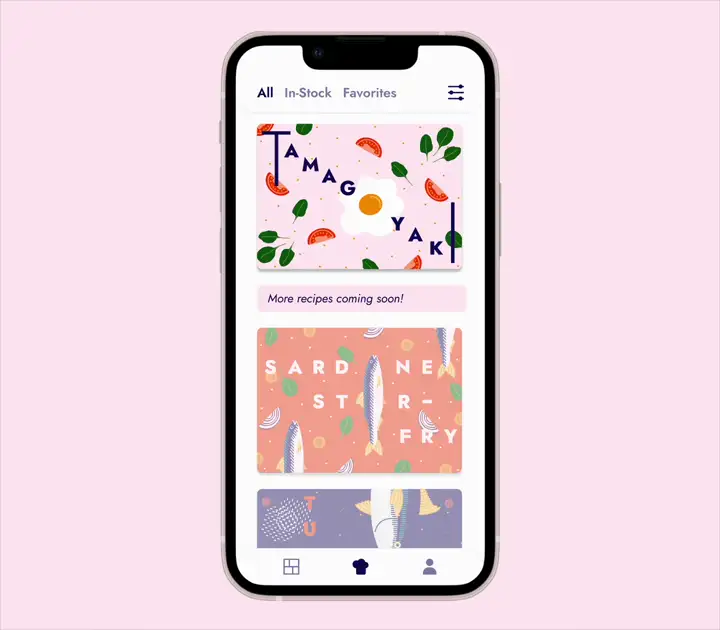
That’s where YOMI began: a set of visual recipe cards offering quick, balanced, and budget-friendly ideas at a glance. I expanded the idea into an app prototype designed in Figma, featuring recipe browsing and pantry tracking.
Stocking a pantry from scratch is a lot of work. I had recently moved to a new country so I took as an opportunity to do some research. I began writing ingredient lists by food category to understand what to prioritize, how to cook with unfamiliar items, and which options were more affordable.
Supermarket visits became research sessions: I observed which regional vegetables were consistently available and inexpensive, then shaped my pantry list around them. This process made me realize that “what should I cook today?” is a universal question—regardless of country, budget, or experience.
These reflections led to the idea of an app that could suggest recipes based on what users already have—especially ingredients that are about to expire. What if instead of asking “what do I want to eat?”, the app could help answer “what can I cook today with what I have?”
🔑 Key Learning:
Finding cheap and nutritious ingredients is a daily
challenge.
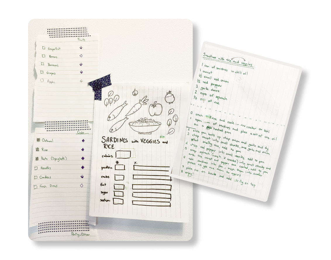
Initial grocery lists and conceptual notes.
One of my key motivations for this project was to maximize resources and minimize food waste. The concept also aligned with my personal values of sustainability and nutrition, which led me to focus primarily on pescatarian and vegetarian recipes.
To build a strong foundation, I defined clear recipe guidelines: each meal would center around one core proteinand combine fresh, seasonal produce with shelf-stable ingredients to ensure both nutritional density and affordability.
I selected 10 recipes from my personal rotation and structured them by limiting myself to 5 proteins—creating 2 dishes per protein. I wrote down the recipes while cooking, testing them in real time and refining both flavor and structure.
The app idea came later, so I scoped a focused MVP prototype for this phase. It featured two core functionalities: the ability to cook a recipe step-by-step and stock a pantry—a minimal version of the broader system I envisioned.
👩🏼🍳 Design decision:
Limit the amount of ingredients for the first batch
of recipes.
For inspiration, I explored
meal prep videos on YouTube, nutritional
rankings of vegetables, and food databases to
compare ingredient profiles and understand the most
affordable, nutrient-dense combinations.
I curated my own food database from sources
like the USFDA and Nutrionix, to reference in
nutritional value calculations later on.

Food database visualization
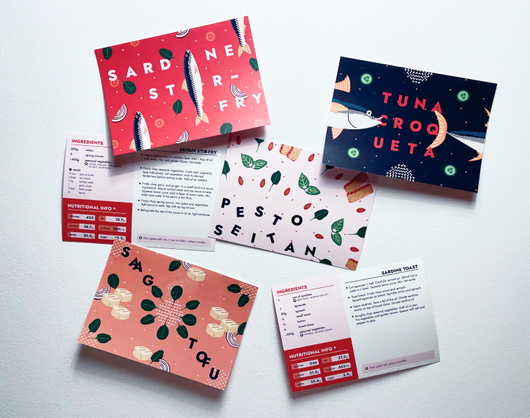
Visually, I drew inspiration from food packaging and illustration styles. I wanted the cards to feel bold and vibrant, so I referenced Mexican design, playful Japanese illustrations, and the color-rich aesthetics of Portuguese sardine cans. These helped shape the color palette and visual tone of the brand.
One side of each card was designed to be highly visual, showcasing key ingredients and creating a quick, appetizing entry point into the recipe.
The goal for the recipe cards was to create a design that was both practical and visually engaging. I aimed for a compact format that could easily fit on the fridge, making it convenient for daily use, while bold, lively colors ensured it would stand out in any kitchen.
Early on, I chose to use illustrations instead of photography. This decision allowed for visual consistency across all recipes, the flexibility to reuse assets, and avoided the complications of food photography—especially in a personal project with limited resources.
I tested different formats and from initial digital sketches , see below, I created a color palette that worked as part of the project’s design constraints. These foundational choices helped shape a clear brand identity early on, and later made it easier to scale the design into a digital product during the app prototype phase.
👩🏽🎨 Design decision:
Use illustrations instead of photography to reuse
assets.
Once I was happy with the sketches, I began by cleaning up initial sketches from Procreate and turning them into vector illustrations in Figma. I also used the nutritional information I collected to include macros for each recipe. As I translated the recipe cards into digital format, the idea for an app prototype started to take shape. Reusing the assets I had already created made it easier to bridge the transition from print to screen while maintaining visual consistency.
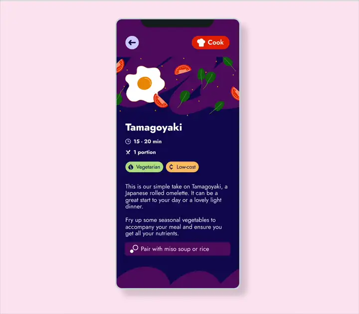
The Tamagoyaki card, a Japanese rolled omelette, was the first recipe I sketched and finalized. It's simple in flavor but challenging in technique. It became the testing ground for exploring layout and design decisions across the format.
To make the most of the limited space, I took a playful approach to typography rather than sticking to strict alignment. I used the egg illustration as a letter, adding a fun visual twist that helped the card feel distinct.
This process helped define a creative, approachable style that set the tone for the rest of the recipe cards.

When all the cards were ready, I printed a limited batch of cards—10 sets of 10 recipes—to share as gifts with close friends. This helped me experience the design in its final, physical form and sparked valuable conversations about developing it into a real product.
The cards were very well received, and I conducted quick interviews and surveys to gather feedback.
👩🏼🍳 Recipe feedback:
Recipes cards were appealing and a viable product.
After the success of the printed cards, I started planning the app. I formalized the brand and tested color combinations for accessibility to ensure that the design would be usable and readable for a wide range of users. Contrast and legibility were key considerations as I refined the visual identity for both the physical and digital experience.
#100B5A
#F53800
#FEA27E
#FFEAF3
0 1 2 3 4 5 6 7 8 9
Design is crafted for clarity, built with purpose.
0 1 2 3 4 5 6 7 8 9
Typography is the voice of your brand.
🔑 Key decision:
Test color combinations to ensure accessibility and
readability for all users.
I decided to make the sardine the project's mascot. This humble, nutrient-dense fish symbolized the project’s values: high in protein, affordable, and often overlooked—just like many good ingredients in a practical, nutritious kitchen.

The logo was designed as a playful element. The "O" emulates a plate that is also a window. What's on the menu changes according to the user's food preferences.
Logo variations
The next step was outlining a simple user flow: what would users want to do when opening the app? For this MVP, I focused on one core action: cooking a recipe.

Cooking flow
Based on that flow, I sketched the screens and defined the key UI elements each would need. From there, I developed low-fidelity wireframes and consulted with developer friends to ensure the designs were intuitive and feasible.
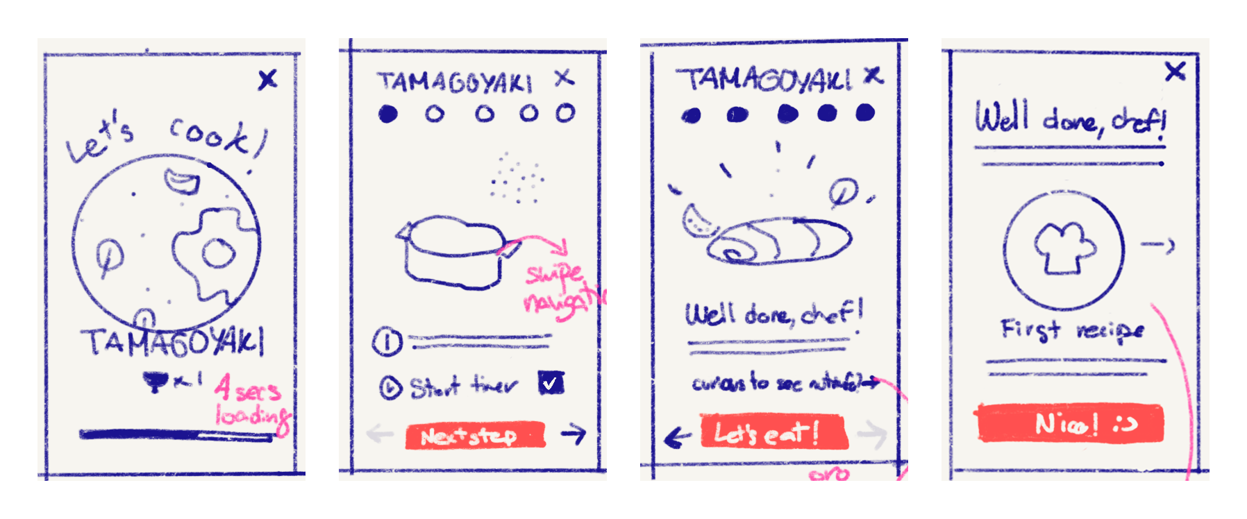

Low-fidelity sketch and wireframe cooking flow
That first round of feedback helped me refine button placement and consider how the app could scale in the future. To avoid increasing the scope, I kept decisions focused and prioritized simplicity—ensuring I could deliver a functional MVP while leaving room to grow.
👩🏽💻 Developer advice:
Leave more complex elements for future iterations.
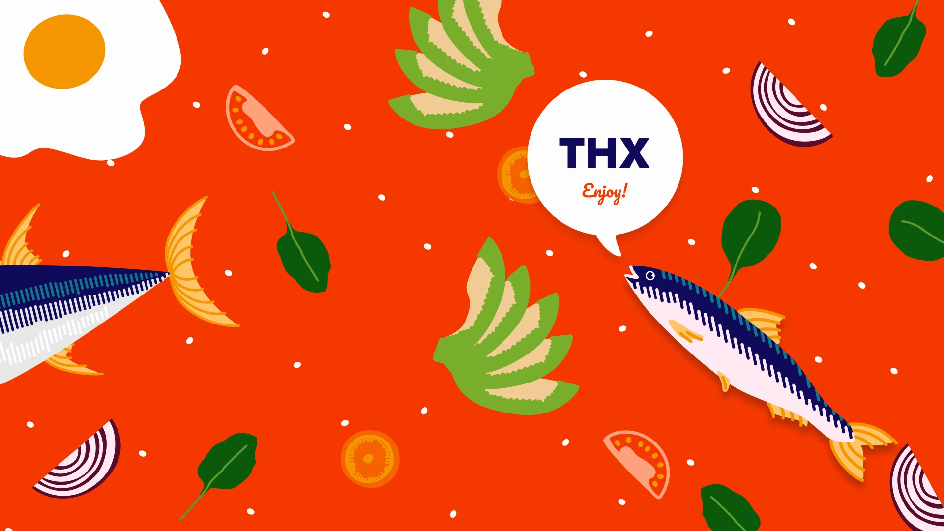
For the copy I used a short, direct tone to make the content feel clear and approachable. Recipe cards included pairing suggestions and ended with a simple “Enjoy.”—a reminder that cooking should be both practical and fun.
In the app, I referred to every user as “Chef” to create an empowering and inclusive experience, reinforcing the idea that anyone can cook with confidence.
As I developed and refined components, I made sure they were used consistently across the project— even if I was the only designer. Having collaborated with multidisciplinary teams in the past, I prepared my work as if it were part of a larger product organization.
I created extensive documentation for each component, anticipating how it might be used by someone new to the project. Drawing from my experience working with localization, I included character limits, content examples, and usage notes for specific screens. I also added developer-ready specs and reviewed them with engineers to ensure no key details were missing.

Documentation for primary icon buttons
I designed the system to be flexible and scalable, using Figma variables to support dark mode and enable simple theming. To test its potential across products, I created a prototype scenario: if this app’s profile screen were needed in a future budgeting app, we could simply switch variable modes and preview it with the new brand colors—saving time and preserving consistency.
👩🏽🎨 Design decision:
Create a scalable design system that can be used for
other projects.
Once the core screens were designed and aligned with the visual system, I built an interactive prototype in Figma to simulate the key flows of the app. This included both the pantry management and step-by-step cooking experiences, ensuring all interactions felt intuitive and consistent.
Even as a personal project with limited resources, the goal at this stage was to validate core assumptions through a small round of user testing. I focused on identifying potential usability issues, gathering initial reactions, and understanding whether the concept could scale into a full product.
I tested the app prototype with both users familiar with the recipe cards and completely new users.
Through unmoderated testing, I observed how users navigated the prototype, took detailed notes, and followed up with a short survey. The feedback was overwhelmingly positive, and gave me a strong foundation to plan future iterations.
Here are a few key takeaways:
Overall, the interactions were very encouraging. Testers were eager to explore more, which reinforced the project’s potential. With this MVP round complete, I was able to save progress and begin planning next steps for evolving the app further.
👩🏼🍳 General feedback:
Users liked the product and would purchase a
subscription.
This project successfully combined practical design with playful visuals, and received positive feedback during early testing. The result was a complete, cohesive experience—designed to inspire better eating habits through clarity, accessibility, and joy.
I plan to expand the project further—adding new recipes to the collection, refining the app prototype, and potentially pitching YOMI as a full platform for cooking, pantry management, and reducing food waste.
This project was crafted with a lot of care and intention, and I hope that shows in all the little details. I thoroughly enjoyed diving into the research, building out visual systems, and sharpening my UI design skills. As a personal project, it brought together many of my strengths and gave me space to explore the topics I care about most.
Working on YOMI made me genuinely happy, and it’s inspired me to keep developing it further. I see this as a platform to continue refining my skills, testing new ideas, and sharing something that feels both useful and meaningful. I’m excited to see where it goes next.
🔭 Closing statement:
Cooking should be fun. All decisions were made with
this idea in mind.
Thank you for reading!