The logo was designed as a playful element. The "O" emulates a plate that is also a window. What's on the menu changes according to the user's food preferences.
Logo variations
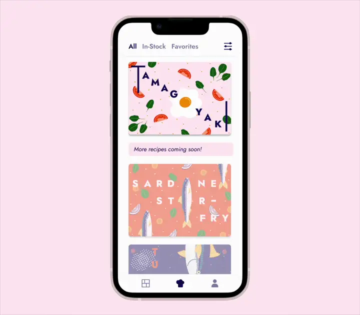
🏆 Outcome: Limited batch of printed cards + App prototype
Deciding what to cook every day can be overwhelming,
especially when trying to balance nutrition, cost,
and convenience. This challenge inspired a set of
recipe cards and app prototype with
nutritious, affordable, and shelf-stable meals.
I created brand and visuals, conducted
the research and produced all the
content.
Continue scrolling for project overview.
Not knowing what to cook with the ingredients I have.
Recipe recommendations based on your pantry.
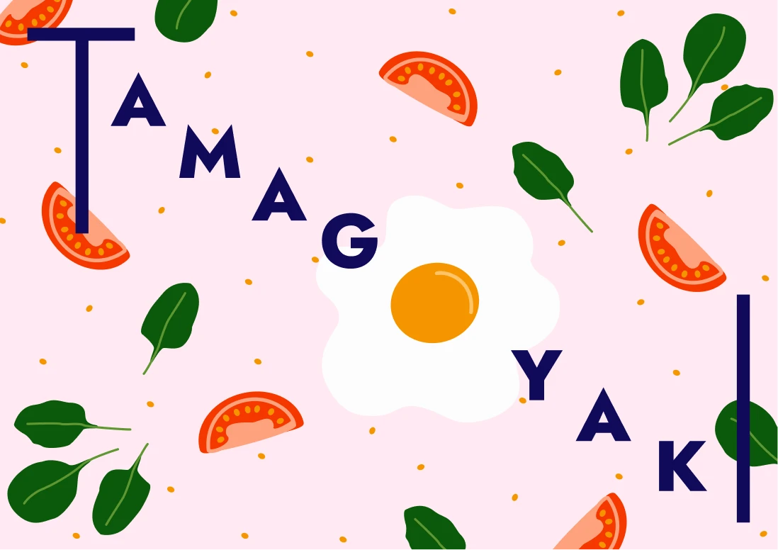
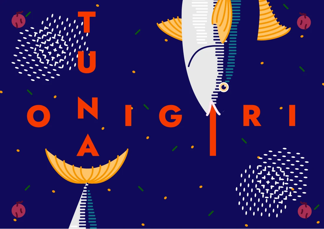
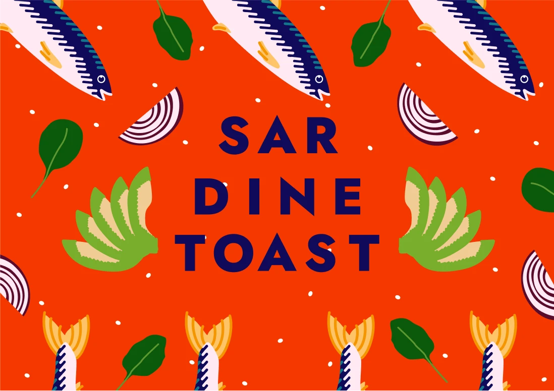
Cooking should be fun. I wanted a brand that encouraged users to feel the same way. I developed a vibrant color palette paired with bold typography and playful layouts to reflect that energy. Since food photography can be technically demanding, I opted for vector illustrations that could be reused across multiple recipes. The result was a cohesive and distinctive visual identity.
#100B5A
#F53800
#FEA27E
#FFEAF3
0 1 2 3 4 5 6 7 8 9
Design is crafted for clarity, built with purpose.
0 1 2 3 4 5 6 7 8 9
Typography is the voice of your brand.
The logo was designed as a playful element. The "O" emulates a plate that is also a window. What's on the menu changes according to the user's food preferences.
Logo variations
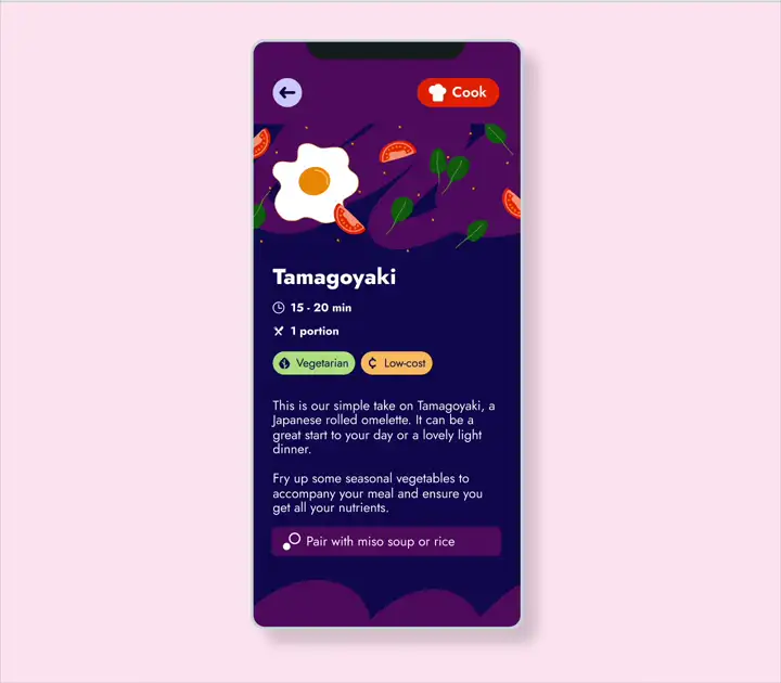
Early on, I decided to use illustrations instead of photography. This choice provided consistency across all recipes, the flexibility to reuse assets, and helped us avoid the challenges of food photography.
All illustrations were created using vector graphics for easy scaling and adaptation across formats, making the visual system more efficient and cohesive.
For the tone of voice, I chose a short and direct writing style to make the content feel clear, approachable, and easy to follow.
To add personality and consistency across the experience, I referred to every user as “Chef.” This small detail served two key purposes: it empowered users by framing them as capable and confident, and it added an inclusive, gender-neutral tone to the interface. The language supported the overall design goal of making cooking feel fun.
It would be great if I could get a recipe recommendation based on what I had in my pantry. This inspired me to create an app prototype that would suggest meals using ingredients that were about to go bad. With this, I would be able to avoid food waste and reduce costs.
I used this idea as the foundation to build an MVP prototype that allowed users to both cook recipes and stock their pantry—creating a system that helped track ingredients over time.
Click here to explore the interactive prototype. Works best on desktop.
I also documented my own design system and prepared reusable components that could scale to additional screens or even expand into future apps. I worked with variables to automatically enable dark mode across any screen I designed, ensuring a more flexible and accessible experience.
🏆 Outcome: Limited batch of printed cards + App prototype
The project successfully combined practical design with fun visuals, receiving positive feedback from beta testers.
Want to know more details about the process?
📚
Here is detailed case study!
See other projects: